Mood is only one of the important effects we create in our efforts as artists to get our viewers to see what we want them to see. (Other main effects that we use include unity, dominance [or emphasis], variety, contrast, gradation, transitions, perspective, balance, rhythm and movement, pattern, and so on.) Establishing a mood will bring character and interest to your painting, while enhancing your subject. MOOD is the pervasive feeling evoked by your painting — for example, calm tranquility or languid, hazy heat. Mood conveys emotion to your viewer.
To intentionally create a different mood (also sometimes called ATMOSPHERE) in your painting, you might manipulate COLORS, VALUES, or CLARITY. To think about this issue more simply, you might consider first whether you want your picture to have a warm or cool feel to it ( COLORS lean toward warm or cool temperatures – see The Paint Colors and Brands on My Palette…, https://leemuirhaman.com/2018/08/28/the-paint-colors-and-brands-on-my-palette/, my blog published 8/28/18.); then you could decide on the dominant VALUE ( lightness or darkness, such as ‘bright and cheery’ or perhaps ‘dark and foreboding’); then, you could define the CLARITY (level of detail) you hope to achieve.
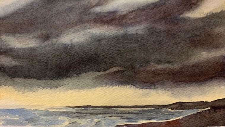
You could also create mood by manipulating the SPATIAL DESIGN of a picture. For instance, a large empty expanse in a painting could be used to create a sense of ease or openness, or even bleakness or emptiness. Converging lines could be used to make the viewer feel confined, closed in, or up close to a subject. To suggest calm and tranquility, keep your main lines HORIZONTAL, with one or two vertical lines to break up the monotony. (Water in a calm scene should be smooth, with mirror-like reflections, and with clouds echoing the predominance of horizontal line.) Strident VERTICAL lines will enhance feelings of awe, even fear. (Crags and mountainsides can appear intimidating, castles will seem impregnable, especially if trees, dwellings, or figures below are made smaller.) Strong DIAGONALS suggest a sense of dynamism and movement, and diagonally directed clouds with ragged edges will produce a sensation of strong winds and restlessness. (Diagonals guided toward the focal point emphasize its importance.)
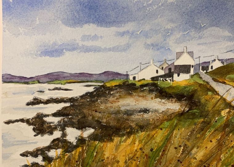
Both value and clarity will determine the lighting in your painting, which in turn, will tell you the intensity of the colors you should use. It is the literal atmosphere that creates figurative ‘atmosphere.’ For instance, the amount of humidity, snow, rain, dust, or fog in the air determines the quality of light that gets through it, as well as the colors and amount of detail we see. Think coastal fogs, dark clouds, or misty mountains! Mood often has a tonal range or value – these ranges can be described as low key, high key or middle key. A low key painting would be dark and could give a viewer a heavy or somber feeling. A high key picture would instead have a bright and cheerful effect. A middle key painting uses a wider range of values which could be used to create a wider variety of moods.
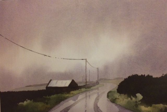
If you want a bright, sunny picture (also called high key) with sharp clarity, you want to use colors that are mostly pure. Do a lot of wet-on-dry painting for sharpness, show distant detail, and use shadows and highlights. In contrast, if you are striving for fog or haze, most of the colors you use will be dulled because of subdued lighting. Use wet-on-damp techniques to produce soft edges, and flatten the background shapes so that they have few details. In this way, atmosphere contributes to ‘mood.’
Why should you worry about mood? Why should you care whether you create a specific mood in a painting? Painters care about mood because a watercolor painting without a mood is dry, generic, uninteresting, and without feeling! Try to move beyond a mere representation or photographic copy of objects in your art. Rather than precisely copying every detail in a picture, you should aim to suggest and imply. While creating ‘mood,’ strive to interpret a scene by choosing the details to include and the ones to leave out. There is no need to tell the viewer everything! Mood adds drama and appeal. Allow each viewer to see something different, to use THEIR imagination, to feel their own emotion, and to participate in your painting. By creating mood and atmosphere when you paint, you will be on your way to creating a visual poetry that stirs deep feeling in your audience.
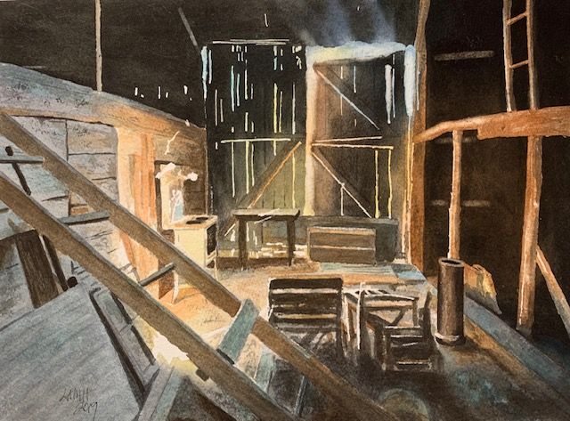
As Joseph Zbukvic says in Mastering Atmosphere And Mood In Watercolor: The Critical Ingredients That Turn Paintings Into Art (p. 55), mood indicators can be mist, clouds, puddles of water on the ground, smoke, sunlight, color, shadow, value contrast, unusual horizon placement, animals or people, types of brushstrokes ( smooth, choppy, chaotic), or line (s-shaped curves, lots of verticals or horizontals, diagonals).
Join me and get painting tips, inspiration, the latest news about classes, new art or products for sale, sent to you in my newsletter. Subscribe here. I’ll give you a free copy of my Color Blending Tips pdf., that you can download and print.

As an amateur water color artist, I just try and paint and get a result I am happy withs since I paint only for myself. I think I do get a “mood” in my paintings, but not because I plan it, it just happens. What do you think? if you’d like to peek at my some of my watercolors I have used them as images in my posts. I’d love your feedback if you feel like popping over. If not, I understand. thanks for your posts. I enjoy reading them.
LikeLike
I think that you don’t give yourself enough credit! I did look at some of the paintings that you posted, and I quite liked them. Mood is a feeling that you have as you paint, and as you paint you aim to get that across to other viewers of your art. When I looked at your driftwood paintings, I saw happy, sunny warmth – they are great, especially the third (redder) one which has a lot of depth. I also found the late summer leaves to be full of feeling and “mood” – I immediately felt the melancholy (before reading your post)!
Keep painting!!!
Lee.
LikeLiked by 1 person
Thank you Lee! That means a lot to me! 😊 I’m working on some close ups of bark and more leaves today. The bark is a difficult subject so my frustration might be the mood that gets projected! 😳
LikeLike
Oh, no! Take a break if you get too frustrated. My art always seems to look better to me after I take a break, or when I come back fresh and rested! Sometimes even solutions to painting difficulties come to me while I’m away from the picture.
LikeLiked by 1 person
So very True. I love your painting Lunar Moth. The bark effect you created is soft and yet you still captured the textures and the moss. I’m struggling with getting the right mix of texture. I’ll keep at it! Thanks again for communicating with me!
Maggie
LikeLike