All artists develop unique ways to create their art – there are many variations in approach to painting, not one correct way.
I prefer an interpretive realistic style much of the time. I don’t strive for a hyper-realistic or photographic reproduction of a scene, but for an image adapted from what I see – one that expresses emotion and shows strong value contrasts. To create good realistic art, you need to make it personal. Your art should reveal what you want to say and what the image means to you. See Realism: Better Than An Exact Copy, a blog post written January 22, 2019, https://leemuirhaman.com/2019/01/22/realism-better-than-an-exact-copy/.
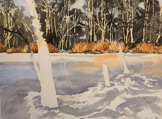
STUDY IMAGE. FINALIZE COMPOSITION.

Template – Flowing Forward.
Initially, I just sit with the image I have chosen to paint. I look carefully, study, and analyze before beginning. (Painting Begins With Looking And Seeing” (12/18/2018), https://leemuirhaman.com/2018/12/18/painting-begins-with-looking-and-seeing/.) I’m trying to anticipate possible problems I might encounter as I paint.
I think about what attracted me emotionally and what details, therefore, will be important to include in the painting. In this way, I design a CENTER OF INTEREST to emphasize. Here, I choose the sunlit orange bushes along the far edge of the river to be my center of interest. I see this focus framed by verticals (tree trunks) and horizontals (shore line and flow of the river). I note that there is open water (where there are reflections) in addition to the hard ice toward each shore. (These differences in ice/open water are barely noticeable, yet important.) I also consider whether there are unnecessary details that detract from the effectiveness of the picture. For instance, I will simplify this image by reducing too numerous tree trunks in a busy background, and by removing distracting branches hanging near the center of interest. However, I decide to keep the broken stump in the foreground because it points like an arrow toward my center of interest.
I might explore lights and darks with VALUE STUDIES, including light, mid, and dark tones. (I want to insure that the greatest contrast of values occurs around my center of interest to draw the attention of viewers.) I like that the orange bushes are surrounded by the dark woods and white ice. I must also keep in mind, as I paint, from what direction the light is coming. I make a note of the sunlit middle ground and shaded distance and foreground. I also occasionally experiment by changing the COMPOSITION (arrangement of shapes) with small thumbnail sketches, especially if I’m combining two photographs or have added/removed some shapes. ( I Have An Image I’d Like To Paint. Now Where Do I Start? 8/21/2018), https://leemuirhaman.com/2018/08/21/i-have-an-image-id-like-to-paint-now-where-do-i-start/.) In this image, however, I like the composition as it is.
PLAN. CONSIDER TECHNIQUES AND COLORS.
More specifically, I consider my plan of attack. Where will I begin painting? Perhaps I’ll start with the background or the sky? I need to have some idea what I want to do, but also want to be open to adapting plans as the painting proceeds. I think about what TECHNIQUES and specific steps I might try. I decide that when I complete my pencil sketch (which doesn’t include every detail shown in the template) on watercolor paper, I will mask the top edge of the orange bushes and a few tree trunks in the distant trees to protect some sunlit areas. I feel that too many details in the distance would detract from the orange bushes, so I’ll try to avoid overdoing the far trees. I won’t mask any of the ice – since open water in the middle of the river will be painted wet-in-wet, while darker hard ice in the foreground will be painted around the lighter ice areas.
As I think about beginning to paint, I think about LAYERS. Some parts of the picture are ‘in front of’ others. This suggests that one would begin painting the ‘behind’ layers or ‘underneath’ layers first. In a watercolor landscape, therefore, painting often starts in the sky or background. In this image, I will begin with the far tree line, above the shore and bushes. Further, I see several colors in the trees, which suggests that several layers will need to be applied to the trees.
But I mustn’t get ahead of myself! Before painting, I consider what pigments might be best to use. I like to create a TEST SHEET with a number of pigment possibilities before I make decisions about what colors to try in an actual painting. (If you intend to paint this image, substitute the pigments you have on hand already. You can see by looking at my test sheets that there are many suitable color combinations.) Since I want the effect of sunlight in the middle distance, I consider yellows that I could use for an underlayer. Originally, I begin with Raw Sienna, but feel it doesn’t ‘glow’, so I then investigate Gamboge and Winsor Yellow. I know I want transparent, non-staining colors for the second layers of both the distant trees and the orange bushes (because the technique I will try in both locations is to scrape the second layer of paint to reveal tree trunks and branches underneath). See the attached photos of my color experimentation for this painting.


Color test sheets – Flowing Forward.
SKETCH IMAGE, MASK, AND BEGIN PAINTING.
I transfer my image to watercolor paper ( Saunders Waterford 300 lb. rough), mask tops of orange bushes, a few distant tree trunks, a few horizontal snow strips in and among the orange bushes, and the small sunlit patch on the right-hand front tree trunk.

Initial sketch with masking – Flowing Forward.
When masking is dry, I scumble in tree shapes (with pale Gamboge) over the far tree line, leaving plenty of ‘sky holes’ among the trees. While this is drying, I mix Raw Umber and Ultramarine Blue to make a dark brown-gray for the next tree layer. I have my palette knife at the ready. When the yellow paint is dry, I scumble varied tree shapes (again leaving ‘sky holes’) over a small section of the yellow far trees. As the shine (of wet paint) starts to dissipate, I use the point and edge of the palette knife to scrape back some tree trunks to reveal the sunlit yellow ‘underneath’. I paint the brown-gray, in small sections, varied but darker at the bottom and lighter higher up, to insure enough time to scrape before the paint dries. (Scraping back color is effective only when the paint is damp/wet.) I finish scraping one section before painting and scraping the next section of tree line.
When the scraped tree line has dried, I dot in some sky color (very pale and juicy Cerulean mixed with Cobalt Blue) in the saved ‘sky holes’.
MIDDLE DISTANCE.
When the distant trees and sky paint have dried, I remove masking fluid from the bushes and far trees. With the same yellow (Gamboge) used for the tree underlayers, I paint an underlayer (with pointy tops) to cover all the middle distance bushes. I let dry. Then I mix the orange for the second layer of the middle distance bushes. I decide to try a mixture of Transparent Pyrrol Orange and Transparent Red Oxide. I’m hoping to apply orange more thinly in some sunlit layers, more richly in more shaded areas. I paint a small section at a time, as with the far tree line, and scrape with the point of my palette knife to lift numerous thin branches out of the orange to reveal the yellow below. When dry, I will be able to shadow below and in the more shaded sections of the orange bushes.

Background painting – Flowing Forward.
WATER/ICE.
I plan to paint the wet, open water in the center of the river with a wet-in-wet technique. This area shows reflections of the sky, some distant tree trunks, and orange bushes. I create three puddles of color to be ready to paint this area. These puddles can be mixed somewhat darker than you might expect, since the color will be diluted to some degree by painting wet-in-wet. First, I combine Cerulean Blue and Cobalt Blue (sky reflection). Second, I form a puddle of Transparent Pyrrol Orange (bush reflections). Third, I mix Cobalt Blue and Transparent Red Oxide to create a blue-gray. At this point I pre-wet the paper, but only in the area where I see reflections and know there is open water (in the center of the river).
When the wet shine just leaves the paper, I pick up some sky blue paint and swoop it onto a small section with horizontal strokes. I immediately pick up some blue-gray and place it across the damp paper, leaving white space for placement of the orange paint, which I paint next. I do NOT mix these colors, but charge them (drop them) next to each other. All edges will remain soft and the colors will remain separate if not mixed on the paper. As the wet shine begins to dissipate, I use a damp thirsty flat brush to lift out a few tree trunk and small branch reflections. I let dry.
I prepare to paint the gray solid ice next. I will leave the lighter sections of foreground ice as the white of the watercolor paper for now, so I mix a medium value gray from Cobalt Blue with just a touch of Transparent Red Oxide.
When applying paint here, I try to keep in mind there are hard edges (wet paint applied to dry paper) where I see the gray meet white ice in the foreground. As the gray ice extends into the center of the river, however, it meets the open water with a soft edge. (I apply the gray paint, adding water to thin the paint and soften the edge where it meets the already painted open water.) I don’t try to darken at the base of the tree trunks yet, although I try to vary the value of the gray as I apply it in some areas, and I also paint a bit of dry brush texture.
Water and ice underlayers painted – Flowing Forward.
GLAZING.
While planning, I have already determined that the foreground is shaded. (See above STUDY IMAGE section.) I use a GRAY SCALE to check the value (lightness/darkness) of the ‘white’ ice in the foreground – I know from past experience that eyes can play tricks. I’m also aware that the value of a shaded object is usually 40% darker than the same object in sunlight, as written by Jan Kunz (Painting Watercolor Florals That Glow (1993), p. 68), and others. When I check the value (on my template) of the sunlit ice and compare to the value of the ice in the foreground shade, in fact, the shaded ice is 40% darker in value! I realize I need to darken its value in my painting, probably by applying a GLAZE. This glazing will help highlight the sunlit center of interest, by contrast. Read Why Should I Bother To Use A Gray Scale? (5/21/2019), https://leemuirhaman.com/2019/05/21/why-should-i-bother-to-use-a-gray-scale/, to learn more about the usefulness of a gray scale.
A glaze is a transparent wash of color using a thin application of transparent pigment. Transparent pigments are desired so that the colors below the glaze, or the white of the paper, in this case, continue to be visible through the finished glaze. Here, I combine Cobalt Blue with just a touch of Transparent Pyrrol Orange (blue-gray) in a thin, juicy mix. After testing the value, I apply a glaze over the shaded foreground with a fairly large, soft brush. I reevaluate the value of the foreground ice and compare it to the value of the sunlit ice in my painting (with the Gray Scale), when the first glaze has dried. If necessary, I will glaze again, on dry paper, until the lighter-shaded, foreground ice is about 40% darker than the sunlit ice in the middle distance. Correct relative values are one of the most important factors in creating an effective image.
FOREGROUND TREE TRUNKS, BRANCHES, FINAL DETAILS.
I combine Raw Umber and Ultramarine Blue to mix a strong blue-black. Dark foreground tree trunks are then painted darker at the bottom and lighter toward the top. Since some higher spots and the left side of the trunks are sunlit in places – I blot the color to remove some paint and provide texture there. I will add some sunlit yellow (Gamboge) only to the sunlit left sides of the trunks (when the blue-black paint is dry).
With the same paint mixture, I add smaller branches up high in the foreground trees and a few thin twigs on the foreground ice. I try to simplify to avoid busyness that would distract from my center of interest.
Then I add some final textures and shadows (with the same blue-black mixture) to the foreground ice (dry brush, dots, a few streaks, with occasional softening of edges). I now make sure to darken the area in the ice circling each foreground tree trunk to suggest depressions.

Finished painting – Flowing Forward.
Finally, I step back and evaluate. I ask myself if my values highlight the center of interest. Do any marks seem out of place or distracting? Are there any adjustments I feel I should make? (It is possible to correct some mistakes and improve watercolor paintings. See I Guess We’ve All Made Painting Mistakes (10/9/2019), https://leemuirhaman.com/2019/10/09/i-guess-weve-all-made-painting-mistakes/.) Sometimes, I set the picture aside for a day or two, and look again later with fresh eyes. Occasionally, a mistake needing to be fixed jumps out at me. At other times, I am satisfied that the painting is ‘finished’.
Join me and get painting tips, inspiration, the latest news about classes, new art or products for sale, sent to you in my newsletter. Subscribe here. I’ll give you a free copy of my Color Blending Tips pdf., that you can download and print.
Photos taken and copyrighted by Tristan T. Haman (https://www.instagram.com/thaman15/).

Such a beautiful painting! It’s fascinating to follow along on your approach.
LikeLiked by 1 person
Thanks, Judith! I appreciate your comment – made my day!
Interestingly, I find it quicker and easier to do the actual painting, rather than analyze the process and translate it into words. Explaining my actions, however, helps me to become more aware (and conscious) of how I paint and why – it does clarify my thoughts.
LikeLiked by 2 people
For me, blogging is a way of “sorting through” concepts I’m learning. Sharing the knowledge helps me understand it better.
LikeLiked by 1 person
Agreed!
LikeLiked by 2 people