Understanding the color wheel makes painting far easier and more fun. It can help an artist to understand complementary colors and color bias, in addition to adding insight into how pigments will interact when mixed together to create other colors, or how a color can be enhanced by nearby colors.
I highly recommend arranging your paints on a circular palette. As some of you may know, I’ve been using the Stephen Quiller palette by Richeson, with paint wells arranged in a circle (like the color wheel), to hold my watercolor pigments. The Quiller palette is large (14” in diameter) with 32 wells to hold paint. I’ve found that organizing paint in a circle helps to think about color relationships and to more easily choose colors for mixing. I can SEE (imagine) how each color might behave when being mixed with other colors, taking a lot of guesswork out of color mixing. I love the Quiller palette, and also the round palettes from robax.com!
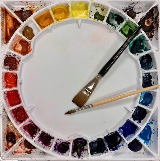
My Quiller palette.
UNDERSTAND THE COLOR WHEEL.
Simply put, the basic color wheel contains the three ‘primary’ colors (red, yellow, and blue) and various intermediate colors which can be mixed from those primaries. ‘Warm’ colors (yellow-green through red to red-violet) are on one side of the color wheel, while ‘cool’ colors (yellow-green through blue to red-violet) are on the opposite side. There is no need to overcomplicate this.
COMPLEMENTS.
The color wheel enables painters to easily recognize ‘complementary’ colors, direct opposites on the color wheel. Such complements are red and green, orange and blue, yellow-green and red-violet. So, how would you use this information? If you add a bit of a color’s complement (e.g., a bit of red to a green wash, or a bit of yellow-orange to blue-violet), the color will be grayed and start to lose its intensity. When mixed together, complementary colors produce grays and browns. The three primaries mixed together will also create grays. If you are interested, see this blog post to understand more fully the practicality of this information: “Secrets To Creating Your Own Fabulous Grays In Watercolor., (1/17/2022), https://leemuirhaman.com/2022/01/17/secrets-to-creating-your-own-fabulous-grays-in-watercolor/ .
Remember, as artist Jean Dobie has suggested in Making Color Sing that ”to complement the pretty (transparent) colors” and to enhance their jewel-like tones you need to set them off with more subtle, “non-brilliant” mixtures. Use the color wheel to create these subtle, muted colors or grays to enhance your paintings.
COLOR BIAS.
Color placement on the color wheel also suggests the degree a pigment borrows from or leans toward another color. Almost all paint colors are ‘BIASED’ in that they lean toward (or contain some of) another primary color and this affects color mixing. One blue can behave very differently than another blue. Few paint colors can be described as a pure, neutral color. This is ‘color bias’ – that is, most paint pigments are not perfect spectrum hues or colors, but contain some amount of another color. A warm red contains some yellow – it ‘leans’ toward and is biased toward yellow, whereas a cooler red would have more blue and would lean toward blue, or have a blue bias. In other words, a color’s placement on the color wheel will tell you much about its bias – a warm red will be placed physically closer (on the color wheel) to the warmer yellows than the cooler blues. (Also, in general, all (grayed) dulled COOL colors have become warmer than their original hue, and dulled WARM colors are now cooler than their original hue.)
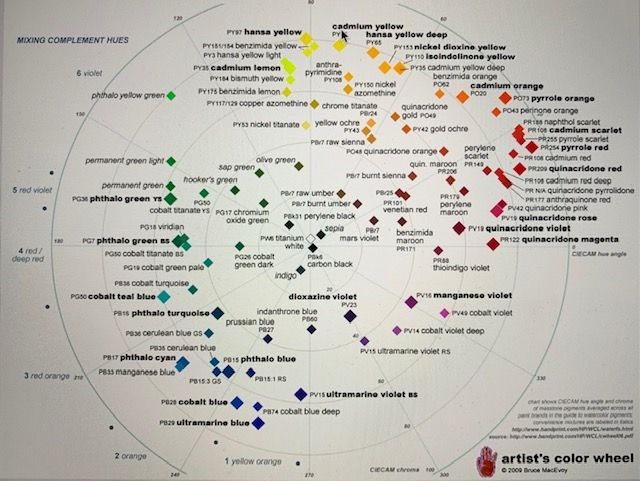
handprint.com color wheel – where common pigments are located on color wheel.
Does color bias matter in practice? Absolutely! Color bias affects the qualities of color mixtures. With knowledge of the color wheel, success in creating a clear and bright color, if desired, as opposed to an unexpected dull mixture, will be much more likely and predictable.
COLOR MIXING.
To mix a BRILLIANT, clear color, you must choose your primary colors carefully! Use two colors that are AS CLOSE AS POSSIBLE to each other on the color wheel. To mix a pure purple, choose a blue pigment with some red in it (such as Ultramarine) to mix with a red that leans toward blue (such as Permanent Alizarin Crimson). Because the blue contains red and the red contains blue, but neither contains any of the third primary (yellow), your mix will remain bright.
On the other hand, if you combine Winsor/Phthalo Blue (which contains some yellow) with Cadmium Red (which also contains yellow), a DULL purple will result. Both the blue and the red, in this case, contain some of the complement of purple (yellow), thus graying the final mixture.
Similarly, you could mix Hansa Yellow Light (or Winsor Yellow) with Winsor/Phthalo Blue to create a bright, spring green. Or combine Quinacridone Gold with Ultramarine Blue to achieve a warm, olive green. Try some of your own combinations! Depending on the specific choices of paint, a whole range of possibilities exist for creating color. Change one ingredient or vary amounts in a mixture to achieve different results. What red and yellow could you try mixing together to create a bright, clear orange?
WHERE DO THE COMMON WATERCOLOR PIGMENTS FIT ON THE COLOR WHEEL?
Since there are so many paints available, understand that if you want to use a circular palette to approximate a color wheel with your paint, you will need to make some CHOICES. But don’t make your choices because you think a color is pretty or you like the name on the paint tube. Those kinds of choices will NOT help you to create an accurate or functional color wheel on your palette.
Instead, I suggest some limits to start. To simplify, you will need both a warm and a cool of each primary color to mix color effectively. Choose just ONE in each category below. Possibilities include:
COOL YELLOW: Winsor Yellow, Lemon Yellow, Hansa Yellow Light, or Aureolin. (Place your cool yellow closer to the blues than your warm yellow.)
WARM YELLOW: Hansa Yellow Deep, New Gamboge, Nickel Azo Yellow, or Indian yellow. (Place your warm yellow closer to the reds than your cool yellow.)
COOL RED: Quinacridone Rose, Permanent Rose, or Permanent Alizarin Crimson. (Place your cool red closer to the blues than your warm red.)
WARM RED: Cadmium Red, Permanent Red, Pyrrol Red, Light Red. (Place your warm red closer to the yellows than your cool red.)
COOL BLUE: Phthalo Blue, Winsor Blue, Prussian Blue, Antwerp Blue. (Place your cool blue closer to the yellows than your warm blue.)
WARM BLUE: Ultramarine Blue, Cobalt Blue, Indanthrone Blue. (Place your warm blue closer to the reds than your cool blue.)
Next, we need to fit in and locate secondaries between these primary colors.
COOL ORANGE: Cadmium Orange, Brilliant Orange. (Place your cool orange closer to the reds than your warm orange.)
WARM ORANGE: Pyrrol Orange, Permanent Orange, Burnt Sienna. (Place your warm orange closer to the yellows than your cool orange.)
COOL PURPLE: Mineral Violet, Permanent Mauve, Ultramarine Violet. (Place your cool purple closer to the blues than your warm purple.)
WARM PURPLE: Quinacridone Violet, Cobalt Violet. (Place your warm purple closer to the reds than your cool purple.)
COOL GREEN: Phthalo Green, Winsor Green, Viridian, Cobalt Green. (Place your cool green closer to the blues than your warm green.)
WARM GREEN: Sap Green, Green Gold, Olive Green. (Place your warm green closer to the yellows than your cool green.)
This will give you TWELVE colors – a good beginning – to space around your color wheel palette. Depending on the number of wells available in your palette, you can add or adjust your colors. Feel free to leave some spaces empty initially if you have a large palette. Or perhaps add an earth color for convenience.
Try to remember, however, that your goal is to APPROXIMATE a COLOR WHEEL on the palette. In other words, DON’T stick a new color wherever there is an open space; instead, try to place it along the continuum of color temperature, close to similar colors. For instance, Quinacridone Gold is a WARM YELLOW and should be placed alongside Indian Yellow or Raw Sienna (other warm yellows). If colors are not placed near related colors, the advantages of arranging in a color wheel format will be entirely negated(!) and you will be more confused than ever. (Use the handprint.com color wheel shown above to help you place your pigments properly.)
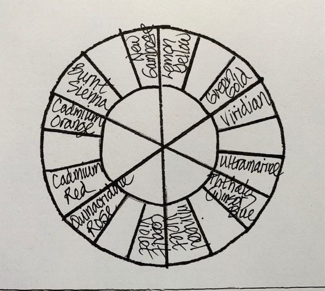
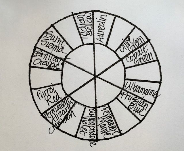
POSSIBLE SAMPLE COLOR ARRANGEMENTS:

ADDENDUM.
As the time of this writing, the standard plastic Quiller palette with cover is available online at jerrysartarama for $30.60 (https://www.jerrysartarama.com/stephen-quiller-palette ). It is also made in porcelain and as a smaller plastic travel palette. You can find it for sale at cheapjoes.com, dickblick.com, amazon.com, or at some local art stores, as well. Another excellent option for a very sturdy, covered round palette is offered by https://www.robax.com/palettes.html. Robax allows you to choose from a variety of options – 8 to 15”, 18 to 85 wells for your paint colors (see below), and an optional carousel. I use both the Quiller palette – for my studio – and a robax model – for taking to workshops.

Assortment of available Robax palettes.
Join me and get painting tips, inspiration, recent art news, or information about new art or products for sale, sent to you by email. Subscribe here. I’ll give you a free copy of my Color Blending Tips pdf. that you can download and print.

The more I read, the more I understand and each bit fills in gas gaps in my knowledge. Thank you for your interesting article.
LikeLike
Diane,
You’re very welcome.
Good for you to always keep learning! The more we learn, the more confident we become.
Thank you for taking the time to comment. I appreciate it.
Lee
LikeLike