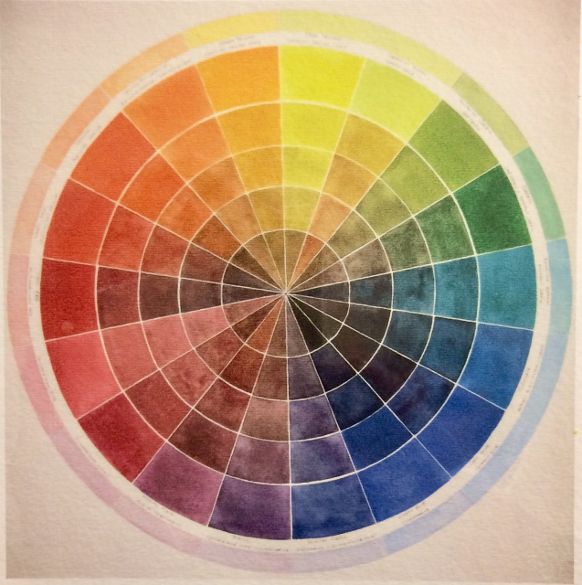
In a previous post, ‘Make the Color Wheel Your Friend!, (9/21/2023), https://leemuirhaman.com/2023/09/21/make-the-color-wheel-your-friend/ , I discussed how to choose the most useful colors for setting up your watercolor palette. I offered three possible options for an arrangement of twelve colors based on the color wheel. But, you don’t need to use the colors I recommend or that any other artist uses. You need to find what works for you.

Nevertheless, when you’re just starting out, it’s always best to begin with a small number of (no more than twelve) pigments on your palette to give yourself a chance to learn the characteristics of the paints and how they interact with each other. You may think that having more colors makes painting easier, but in many ways, more colors can complicate, possibly confuse, color mixing. Some colors don’t mix well together. Since it will be unlikely that you’ll become a good painter by relying on only colors straight from the tube – it is an advantage to start to practice simple color mixing.
LEARN TO PREDICT.
Learn the basics before adding lots of pretty colors to your palette. You want to become able to understand how the paints you have chosen to work with will behave, so that you can PREDICT color interactions, and not have to rely on guessing possible results when you use your colors. Try (by experiment and practice) to learn which combinations create bright color or which make more muted, muddy color. Record your preferences in a journal or color chart for later use.
Remember, try to understand your colors and the role they have on your palette. For each color, you should know its strengths, limitations, and how best to use it. Adopting any color palette means nothing if you don’t understand the colors, enjoy them, and actually use them.
EXPAND ONLY WHEN CONFIDENT.
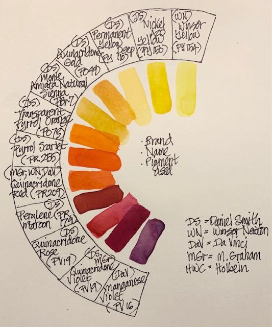
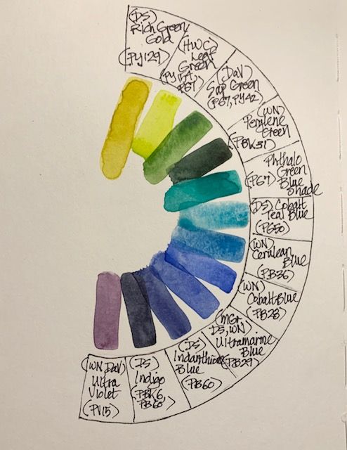
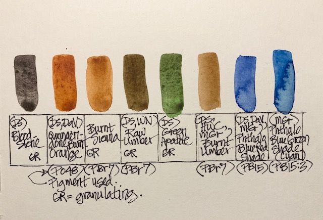
When you feel more confident about basic color mixing and can reliably predict results, you can begin to expand your colors. On my own palette, I have expanded the basic twelve colors, but I still choose mostly basic, ‘workhorse’ pigments rather than fancy mixtures with catchy names. I want reliable paints that tend to be mostly transparent, to be made from single pigments, and to be very lightfast. I aim for a mix of warm and cool colors. As I describe my current choices below, however, notice that there are a few ‘convenience’ colors and supplemental colors for ease in painting.
MY WARMER COLORS.

MY COOLER COLORS.

MY SUPPLEMENTAL COLORS.

‘FUN’ COLORS.
I admit, at times I do get tempted to try the ‘fun’ colors, since I enjoy color so much. I try to experiment and get to know these new purchases before using them in a painting, however. I want to know what to expect. My main palette is my workhorse – it has my basic, pure colors on it – and I use those colors for all my pictures. I do, however, have some small covered palettes for ‘occasional use’ or ‘fun’ colors to use as the mood strikes. The small covered palettes I really like are offered by cheapjoes.com (https://www.cheapjoes.com/extra-color-palette-for-cheap-joe-s-piggyback-palette.html) and are called Extra Color Palettes. Using these small palettes, I have fun colors at the ready, to use one or two at a time, but not distracting me from the main palette colors that I know well and depend on.
You are not bound to your color choices. The colors on your palette can be changed, and your choices will evolve over time.My own reevaluation of pigments seems to be an ongoing process, because just when I think I have finalized my color preferences, I find another irresistible and useful hue! I have also removed some colors that I never seemed to use. Your palette colors will reflect your own preferences.
Join me and get painting tips, inspiration, recent art news, or information about new art or products for sale, sent to you by email. Subscribe here. I’ll give you a free copy of my Color Blending Tips pdf. that you can download and print.
Leave a comment