Only occasionally, as artists, do we discover a perfectly designed composition we’d like to paint. More often, we find an appealing image that needs some improving and editing to make it more effective. Editing allows an artist to interpret a scene and tell the picture’s story in a stronger, more personal way. All the information may be there in front of us, but we may want to re-organize some of the parts. We might want to combine several reference photos, or totally remove some distracting information. We know we don’t want to just copy a reference, but how would you go about ‘improving’ a composition?
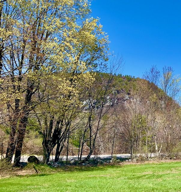
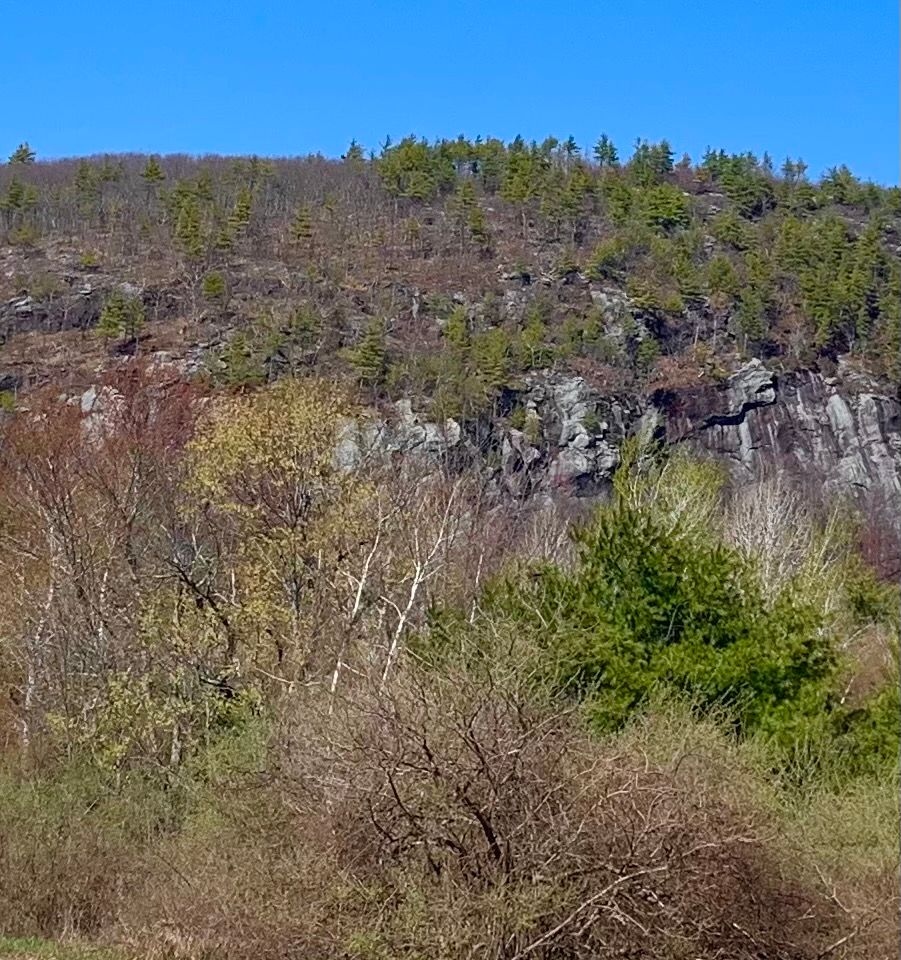
Here is an image that appealed to me. Let’s evaluate the composition though – it does have some problems. It’s hard to tell what this picture is about, isn’t it? It probably wouldn’t make a very good painting, as is. What attracted me to this scene in the first place? I was drawn to the dramatic cliff (barely visible in the photo) rising steeply behind the vibrant, early spring colors. So, my first decision would have to do with figuring out what I want my center of interest to be, and then deciding how best to emphasize it.
I decide to make the cliff my center of interest. How could I simplify some of the shapes or eliminate unnecessary detail? There is too much information in this reference photo. I certainly don’t have to include all of the trees from the photo. I will remove some of the smaller trees blocking the view of the cliff to uncover it. I will also eliminate a few trees on the far right, but leave one tree to help frame the cliff. This tree on the right would also function to stop your eye from following the line of the top of the far hill right on out of the picture. While I think the large green gold trees on the left also function as a frame of the cliff, I want to move them more to the left to further open up our view of the cliff. And I want to increase the height of the trees on the left, hoping they appear closer to the viewer and increasing depth in the picture. And finally, I plan to exaggerate the size of the cliff to make it even more prominent in my painting.
Color will be important to give the picture the feel of the new leaves and grasses of springtime. Spring is a time of fresh growth, when buds and flowers burst forth. Fields and forest floors are becoming free of frost and snow, and bright green shoots begin to appear. I hope to exaggerate the brightness and variety of colors in the final painting by using bright complementary colors. Reds and greens (complements) will be used for newly emerging leaves, and yellow and green gold leaves will complement purple-tinged rocks and purplish shadows. Muted grays and browns are planned to contrast with the bright colors.
I hope to make use of differences in color temperature as well. Cooler colors on the distant hill (and minimal detail) should help it recede, increasing depth in the painting. In contrast, warm yellow greens in the foreground field and trees should advance.
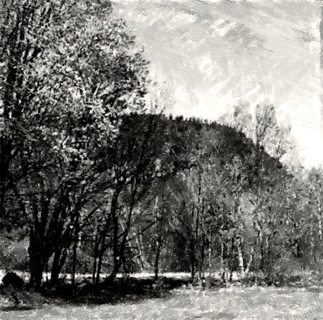
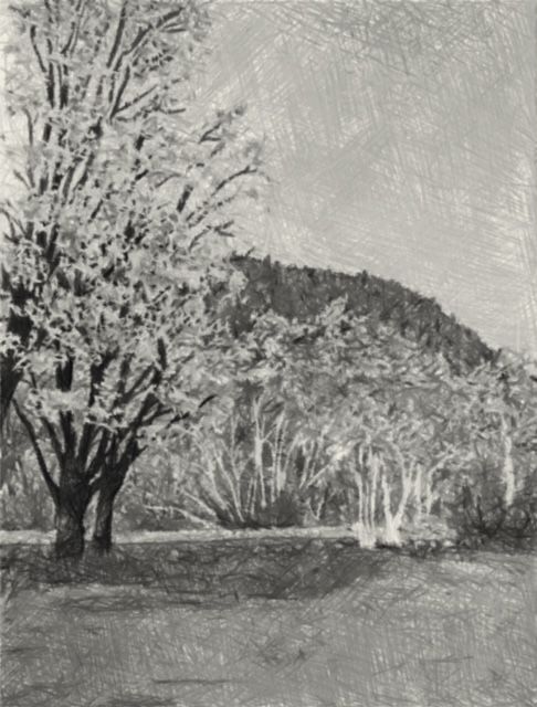
Values (lights/darks) in the reference photo seem to be much too similar. By looking at this black and white version of the reference photo you can see there is very little contrast in values. If there are too many areas of equal light intensity (or a lack of shadows) in a painting, the image will tend to look flat, less interesting, or bland. I will need to create more contrast to make the picture work better! Good value contrast (with light values close by and emphasized by darks) can create the illusion of light, depth, and a center of interest.
After experimenting with several small thumbnail sketches to find a better arrangement of strong lights and darks, I chose this arrangement.
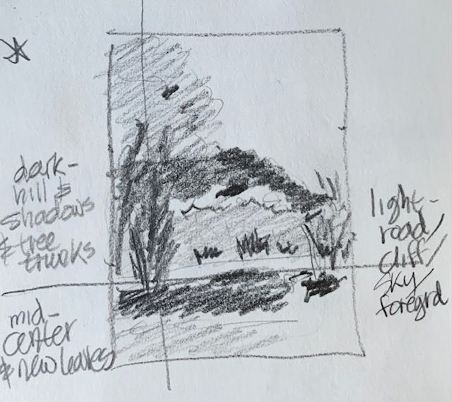
The lightest values in the painting will be the green gold leaves, road, cliff, some saved light birch tree trunks. Mid-values are planned for the middle distance trees on the opposite side of the road. And the darkest values, which will help to highlight the cliff, will be the top of the hill, dark shadows and tree trunks.
Below is the finished watercolor painting, and its black and white version, which resulted from the improved composition.

Join me and get painting tips, inspiration, the latest news about classes, new art or products for sale, sent to you in my newsletter. Subscribe here. I’ll give you a free copy of my Color Blending Tips pdf., that you can download and print.

Leave a comment