In the early days, pigments for painting were rare! The specific ingredients and recipes for making paints were closely guarded secrets. These paints were made by hand from soils, minerals, animal matter, and other materials. The paint did not keep well and had to be made frequently from scratch.
MODERN PIGMENTS.
Modern pigments, although still using some of the same ingredients, are manufactured from a wide variety of substances, often through complicated chemical processes. Many more different pigments are available to painters today, with an incredibly wide range of color choices. Because we now have so many colors to choose from, it is necessary to narrow down the options and simplify.
COLOR NAMES AND PIGMENT NUMBERS.
A painter can’t possibly use every tube color out there, and there is such overlap between brands and ‘named colors’ offered that it wouldn’t make sense to try every one. Be aware that the name given on each tube can be very deceptive! For instance, some ‘raw siennas’ are not really raw sienna at all, but are made from the yellow ochre pigment. A ‘sap green’ in one brand looks different and is made from very different ingredients than ‘sap green’ from another company. The color you think you’re buying is not necessarily what you get! Further, some paints offered are unreliable and fade when exposed to sunlight.
What’s to be done? READ LABELS (just like at the grocery store) to know what you’re getting and to get the best products. On tubes of watercolor pigment, look for the pigment LETTERS and NUMBERS printed on each tube to tell you what the paint is actually made from – companies often include this information in small print on the tube. The letters indicate the pigment hue (color); for example, PB means ‘pigment blue,’ and PR stands for ‘pigment red.’ The numbers that follow the letters are those assigned internationally for that pigment material; for example, a true viridian paint contains PG18 (or ‘pigment green number 18), not something else that might look like viridian.
Using pigment letters and numbers instead of just color names will help you learn to be more aware of what paints you are using. Gordon MacKenzie, in his book The Watercolorist’s Essential Notebook: Landscapes, goes into a lot of detail explaining which pigments to AVOID because of unreliability. Mr. MacKenzie also shares which brands have the BEST quality in which colors. (It is interesting that no one brand offers the best quality in every color they produce!)
COLOR.
In choosing colors for my watercolor palette, I tried to consider color characteristics. The FOUR characteristics of color to think about are: 1. HUE is the name of the pure simple color, e.g. blue, yellow, red. (Hue describes the pigment’s location on the color wheel.) 2. VALUE is a pigment’s lightness or darkness. 3. INTENSITY is the brilliance or saturation of a color. (A pigment can be dulled by adding its complementary color – the color opposite it on the color wheel – which in the right amount produces gray.) 4. TEMPERATURE is warmth or coolness of a color. Reds, oranges, yellows are said to be warm, while greens, blues, or violets are thought of as cool. A color or hue can ‘lean’ toward either the warm side or the cool side, and the direction it leans affects how it behaves during color mixing with another hue. In order to be able to mix pigments into a wider range of colors, try to choose both a warm and a cool version of the primary hues.
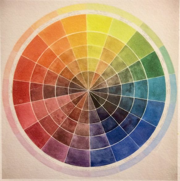
COLOR WHEEL.
On the color wheel, colors are placed in position on the circle to indicate their degree of warmth or coolness and their relationships to each other. Color placement on the wheel can therefore suggest the degree of borrowing or leaning toward another color – a ‘warm’ red (like cadmium red) is closer to the yellows and also contains more yellow than a ‘cool’ red (permanent alizarin red) which would be closer (on the color wheel) to and contain more blue. You can follow the colors around the color wheel to see how much borrowed color is in each pigment.
COLOR MIXING.
It becomes easier to combine colors when you can visualize your pigments on the color wheel. For this reason, I decided to try the Stephen Quiller watercolor palette, which has wells for pigments arranged in a circle (color wheel) for ease of color mixing. (The Richeson Stephen Quiller watercolor palette is available on jerrysartarama.com for $22.99, as of the time of this writing.)
CHOOSING YOUR COLORS.
In many ways, choosing particular colors for your palette is a matter of personal preference. Yet, there are a few guidelines. Recently, I have been searching for more transparent watercolors to add to my palette. I find that having too many opaque colors in a painting can destroy the GLOW of light that I hope to get down on my paper. However, I wanted to keep a few opaque colors on the palette. Also, I tried to to include some brilliant, staining colors, as well as some fairly transparent earth pigments. Such a variety of colors allows for mixing a wider range of colors. My reevaluation of pigments seems to be an ongoing process, because just when I think I have finalized my color choices, I find another irresistible and useful hue!
MY COLORS…TODAY AT LEAST.
So, what colors do I have on my palette today? These are the 24 colors that I placed around the circle (with some exceptions to the color wheel theory just because I liked the colors): Hansa Yellow Light PY3 (Daniel Smith or DaVinci), Gamboge Hue PY153PY3 (Daler Rowney or DaVinci), Indian Yellow PY153 (Daniel Smith or DaVinci), Raw Sienna PBr7 (Daniel Smith or DaVinci), Light Red PR101 (Holbein), Indian Red PR101 (Holbein or Winsor Newton), Cadmium Red PR108 (DaVinci or Daniel Smith), Pyrrol Red (Daniel Smith) OR Winsor Red (Winsor Newton) [both are pigment PR254], Quinacridone Red PR206 (Daniel Smith), Quinacridone Pink PV42 (Daniel Smith), Quinacridone Violet PV19 (Daniel Smith or M. Graham), Mineral Violet PV15 (Holbein), Mauve PV19PB29 (DaVinci), Payne’s Gray PB15PBk6PV19 (Winsor Newton or Maimeri), Ultramarine Blue PB29 (Daniel Smith or DaVinci), Cobalt Blue PB28 (DaVinci), Phthalo Blue RED SHADE PB15 (Daniel Smith, DaVinci, or M. Graham) OR Winsor Blue RED SHADE PB15 (Winsor Newton), Cerulean Blue PB36 (Holbein or Winsor Newton), Blue Apatite Genuine (Daniel Smith), Phthalo Green BLUE SHADE PG7 (DaVinci or Daniel Smith) or Winsor Green BLUE SHADE (Winsor Newton), Viridian PG18 (DaVinci or Daniel Smith), Sap Green PG7PY42 (DaVinci!!!), Shadow Green PBk31 (Holbein) OR Perylene Green (Winsor Newton), and Rich Green Gold PY129 (Daniel Smith) OR Azo Green (M. Graham). In the 8 corner wells, I added some fun, supplemental colors: Quinacridone Gold PO49 (Daniel Smith), Burnt Sienna PBr7 (Daniel Smith, Holbein, or Maimeri), Quinacridone Burnt Orange PO48 (Daniel Smith), Brown Madder Quinacridone PV19PR101 (DaVinci) OR Red Iron Oxide PR101 (M. Graham), Phthalo Blue GREEN SHADE PB15:3 (Daler Rowney or Daniel Smith), Manganese Blue Hue PB15PW5 (DaVinci or Holbein), Burnt Umber PBr7 (Daniel Smith or Holbein), and Bloodstone Genuine (Daniel Smith).
BASIC COLOR RECOMMENDATIONS.

What a great article on color. Thanks for all the valuable information. You have a rich pallet. I have some of those colors but not all. I keep mine to about 12 colors. I don’t have a violet at all which maybe I should. I just mix my blues and reds to get purple shades. But its a color I will consider adding. 🙂
LikeLike
The colors are beautiful.
LikeLike
Yes! Color is fascinating – I never seem to tire of it.
LikeLiked by 1 person