How can you create the look of a three-dimensional object or scene on a flat piece of paper? You create form in a picture, in part, through the use of TONAL VALUES: lights and darks will suggest weight and mass in your painting. In other words, contrast and variation of values (lights and darks) will indicate form, space, and depth. Shadows, for example, on a field will appear as SHAPES lying on the surface of an object, following the contours and revealing the form of the underlying object.
HOW LIGHT AFFECTS CURVED AND FLAT OBJECTS.
Many of the objects you paint will be a combination of CURVED and FLAT surfaces. Light interacts differently with each of these surfaces, so pay attention to value changes in order to paint a convincing illusion of three-dimensional form.
On a CURVED surface, darks and lights change continually and smoothly. When painting a curved object look for a ‘core’ shadow with reflected light on the dark side as well as a slight shadow on the lit side. The change from light to dark on a curved object is GRADUAL across its surface. The direction of the LIGHT shining on the curved object determines where different shadows and lights will fall.
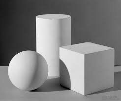
In contrast, a viewer can perceive FLAT surfaces because of a contrast of value between EACH of the surfaces. Each side of a cube, for instance, receives a different proportion of light. Value does NOT stay constant across each surface, but changes slightly as each side recedes.
VALUES OF COLOR VS. BLACK AND WHITE.
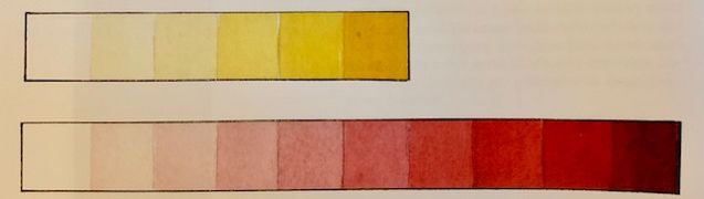
Color is made up of both HUE (the name of the pure color) and TONE. Each color (hue) has a quality of lightness or darkness. (Yellow has a lighter value/tone, for instance, than red.) Differences in the value/tone of a color are easy to see when the colors used are not very intense (or strong). However, the brilliance or intensity of colors can INTERFERE with your ability to isolate and focus only on the lightness/darkness of color, thus making it difficult to judge tonal values in a painting. SQUINTING your eyes can help you see the proper tone. As you squint, look only for the difference in lightness or darkness of an area.
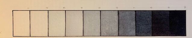
A black/white GRAY SCALE (a card with gradations of white, gray, and black) can make it easier to judge value in your picture. Alternatively, print out a BLACK AND WHITE COPY of your reference photo, or draw a VALUE SKETCH of your scene including lights, mid-values, and darks for reference while painting. In black and white you will see the tonal values of the subject (without the distraction of the colors). This new way of seeing will help you compose, simplify, and adjust values in your painting. With practice, you will be better able to recognize values/tones and to recreate them in your painting.
When you look at your painting subject, look for a range of values/tones from light to dark. However, keep in mind that VALUE in a picture is always RELATIVE. Observe the strength of value/tone in one area of the picture in relation to all the other values in the same picture. When you squint, you will notice that highlights and darks are visible to you while non-essential details tend to blur. Instead of trying to reproduce every value you see, try to simplify your image into at least three (no more than five) tonal values, e.g. light, dark, mid-tone. You can start your painting with pale undertones to establish the layout of your composition. Leave highlights as the white of the paper. Mid-tones are often painted next, overlapping some layers to build up color. Dark values are usually the final layer of building up paint in your watercolor painting. Having the lighter layers painted, you will find it easier to evaluate just how dark you need to paint your darkest colors.
CONTRAST OR VARIATION IN VALUE/TONE.
CONTRAST (the relative difference between light and dark areas in a painting) is one of the ways in which the brain distinguishes one thing from another (and sees forms). The stronger the contrast, the more the area attracts attention. Contrast helps a viewer differentiate between subject and background in a painting and also is important in directing the viewer’s eye to the center of interest, especially when the center of interest is the point of greatest value contrast.
Contrast is dynamic, suggesting excitement, attracting attention, and relieving monotony. Contrast creates a tension between the opposing elements, a push and pull, to provide visual strength and make a forceful statement in a painting. (COUNTERCHANGE is the term used for placing light and dark tones next to each other to create impact.) Every artist wants to paint a picture that has some impact! To create a stimulating painting, include strong contrasts in values.
Contrast in VALUE is the most common form of contrast used by artists. (Other possible types of contrast are contrast in temperature, in energy, and in purity of color (bright or muted).) While painting, artists try to arrange and modify the values of various parts of a picture, depending on what they want to emphasize. Sometimes they alter values, from those values seen in reality, to make a stronger composition. If you squint at your painting and certain areas appear undifferentiated from each other, with the areas having very similar values, you probably will want to add more value contrast to your work. Make shadows darker or reduce some detail in the bright highlights to make your painting more dramatic. Strive to ensure that darker and lighter values alternate across the painting and that there is tonal variation WITHIN each wash for variety.
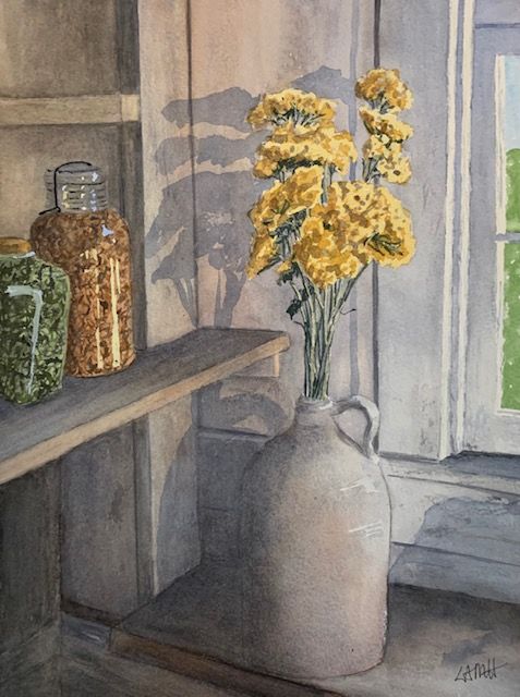
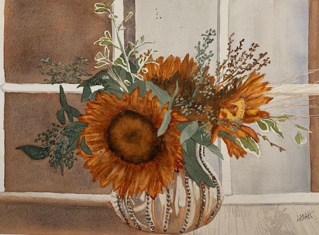
In the above watercolor painting, note the contrasts in value and color temperature in particular. Are there soft and hard edges? What draws your attention in this picture? What techniques suggest depth and three dimensions?
EDGE VARIATION.
Since VARIATION is important in watercolor, also allow some edges (perhaps in shaded areas and highlights) to merge into areas of similar tone and to be less detailed. (This is called LOST AND FOUND, or HARD AND SOFT EDGES, or fading and disappearing edges, or broken or inferred edges.) When edges appear or disappear or are soft, they create a sense of movement in a painting, allowing the viewers to imagine or interpret what they see. In contrast, hard edges define SHAPES and hold or direct the viewers’ eye. By employing hard and soft edges, the artist can further refine the creation of distance, depth, and form.
PERSPECTIVE.
Also use PERSPECTIVE ( a succession of spatial planes receding into the distance) to help you create believable space and form. When you place a light-toned object in front of a darker one, it appears to be positioned in front of the other spatially. Larger objects will seem closer than smaller ones. In general, more distant objects tend to appear paler, bluer (cooler) in color, and less detailed.
IN SUMMARY.

Your paintings are beautiful and I really like your lessons. I look forward to trying them, but for now I just enjoy reading them! Thank you!
LikeLike
Thank you, Victoria, for the compliment! And you’re very welcome.
So glad you’re enjoying the blog posts and I hope you can get some helpful tips.
Feel free to re-read the posts later and ask any questions that dawn on you.
Lee
LikeLike
Another great lesson. I am really trying to get more realism and 3-D depth into my paintings..especially my leaves. I’m struggling with finding the light, dark and mid-tone values from my reference photos, so I will add a black and white photo as reference as well and see if this helps me define these areas better. Thanks for the suggestion. 🙂
LikeLike
I’m glad you liked this. Yes, practice using a black and white copy of your reference photo right next to your colored reference picture. Compare the two as you paint. With a little practice you will be better able to pick out the lights and darks from the color reference. Also, remember to squint occasionally, which also helps you see the light and dark tones. Happy painting!
LikeLiked by 1 person