The first step in a watercolor painting is usually choosing an image to paint. Sometimes I am excited about a subject or intrigued with the way light affects a scene. That image can make me feel a certain mood or remember a wonderful feeling I’ve had before in a similar setting. Often, the scene “picks me”: it touches me, and I want to paint it.
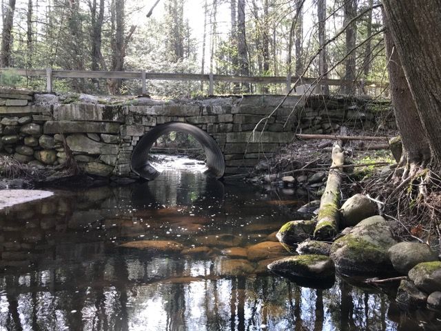
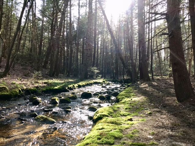
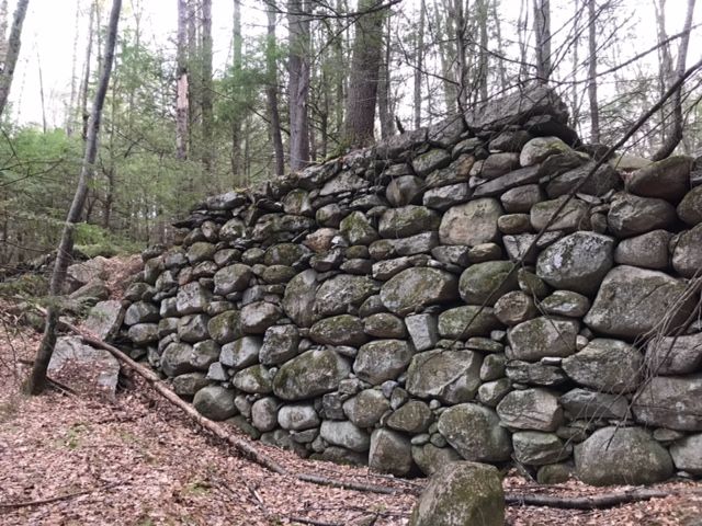
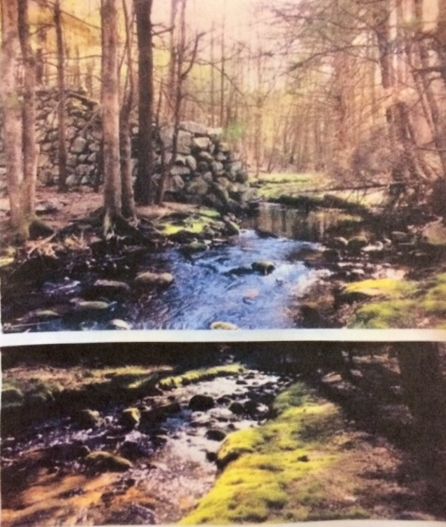
The painting “Mulpus” began in this way. When I saw the photos that my son had taken of a brook that we both know, I felt the excitement of discovering a magic secret garden in my backyard. The series of photos taken on a clear spring day showed a progression from the old stone bridge on the road up the sparkling brook edged with bright green moss and grass to the ruins of a towering stone wall dam that in the 1700’s had controlled water for a log-cutting mill. The dam, though still impressive, was partially collapsed and the mill pond gone, but, oh, the water sparkled, and the green of the moss and grass was brilliant! How refreshing! In the midst of decay was renewal. I could almost feel the warm sun, see the rosy buds about to open, smell crisp, clean air, and hear the soft whisper of the breeze!

I settled on two reference photos to combine and sketched a template for transfer to watercolor paper. When I had the image drawn, I used masking fluid to preserve the sparkles of white on the water, the bright green shore, and highlights of the rocks in the water.

When the masking fluid was dry, I pre-wet the sky and tree line area with clear water. As the sheen disappeared, I painted the sky with a very pale wash of a mixture of mostly cerulean and some Winsor (or phthalo) blue. I tried to leave the center of the sky area paler than the surrounding sky because I chose to have the sunlight shining from the center of the picture toward the viewer.
Keeping in mind a clear spring day, I mixed colors for the far tree line. Spring green was a possibility, but these trees were in the background, and I did not want them to stand out or compete with the bright green grass and moss which would be the focal point of the picture (in conjunction with the sparkling water). Therefore, I toned the green down a bit to a slightly-grayed blue-green mix of ultramarine blue, DaVinci sap green, and a small touch of burnt umber. And since I wanted the distant trees to appear soft and unfocused, I painted the tree underlayer onto damp paper. (If you mix this tree color at the same time as your sky mix, you’ll be ready to paint your tree line as soon as you finish the sky. However, if you find your paper has dried out since you painted your sky, it’s perfectly fine to rewet your sky and tree line with clear water, then paint your tree line when the sheen has gone.) While the tree line is still damp, scrape in a few trunk-like lines with a palette knife or brush handle. (Some pale gray trunks can be added here later and softened.) Also, while the distant tree area is still damp, randomly drop several other colors into the tree area to add variety. For me, these colors were a touch green gold and separately also burnt umber (mixed with a touch of burnt sienna). Don’t get carried away here – less is more. Every tree you paint should have a variety of colors in it. As these color additions started to dry, I used a slightly stronger version of the underlayer green (ultramarine blue, DaVinci sap green, and a touch of burnt umber) to scumble in and start to suggest shadowing and shaping of the tree line.
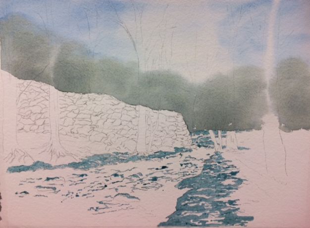
I began to work on the large stone wall by mixing three separate puddles of very, very pale color to apply as an underlayer. I used permanent alizarin red (or quinacridone red), cobalt blue, and hansa yellow light (or cadmium lemon) to mix these three puddles. These colors I randomly painted onto the stone wall; each color remained separate but just touched another of the three colors.

While the stone wall dried, I began to put down the first layers on the middle distance tree trunks (which would eventually have more detail than the distant tree line). I started with the trees to the far right to avoid spoiling the stone wall before it dried; then I gradually worked toward the left. Since the type of tree, the age of the tree, and the smoothness of the bark cause variations in the tree trunk color, I used more than one paint color. First, I laid down a pale greenish gray made with Davy’s gray. Almost immediately, I began to add variation – some green gold and/or raw sienna on the sunny side of trunks, and darker brown-gray made of ultramarine blue with burnt umber on the shaded side. I needed to remember the direction of LIGHT for shadows: because I chose to have the light come toward the viewer from the middle of the picture, shadows on the trunks are on the right side of a trunk on the right of the picture, but shadows on the left side of the picture are on the left side of the trunks. I laid these colors in without mixing.
I painted one tree at a time so that the colors could soften into each other and create shape in the trunk before the applied paint had a chance to dry. I let these underlayer colors in one trunk dry before proceeding to detail work on the trunk and moved instead to underlayer the next trunk. When all the mid-distance trees were underlayered, I added details (crevices and knotholes) with a dark brown of ultramarine blue and burnt umber. This same color I used to dry brush a bit of texture on the tree trunks, including grooves and shadows at the roots.
I then painted another layer of color, made from cerulean blue with a small touch of cadmium red to make a gray, over all of the large stone wall. The color was not too dark, but pale enough to see hints of color through it. When this was dry, I painted details in the wall – for example, crevices, shadows, texture – with a gray-black mixed from ultramarine blue and burnt umber. I left light some highlights on the top of the wall, though I could also have lifted them later.
A light layer of burnt umber I laid over the earth area to the right and left of the stream. I let this layer dry while I began to paint the water in the stream.
The water I painted wet-in-wet. For this technique, it is best to have all the colors ready BEFORE starting to apply any paint. To get ready, I mixed five separate puddles: cobalt blue; ultramarine blue; burnt sienna; ultramarine blue/DaVinci sap green/burnt umber; and ultramarine blue/burnt umber. The first layer put down on the pre-wet paper was a layer of cobalt blue over all the water, avoiding the rocks. Some of the green mix I dropped into the cobalt blue near the shore of the pool next to the ruined dam and close to both shores to suggest reflections from the distant tree line and the grass and moss along the shore.
Before the water dried, I added some burnt sienna in the water closest to the left front corner. These transparent colors (cobalt blue and burnt sienna) made it seem that the viewer could see through the water to the sand on the streambed below. Again, before the water dried, I darkened the edges of the water in particular with ultramarine blue. Closest to the shore, where the bank overhangs a bit, I added some ultramarine blue/burnt umber mix (blue black) and made sure the color was softened as it met the rest of the water.
While the water was drying, I worked more on the forest floor. With burnt umber and then with a dark brown/ burnt umber mix, I darkened the ground toward the far tree line on the right and up close to the large stone wall on the left, where the ground would be in shadow. I added some texture and a few darker indentations in the fallen leaves with the dry brush technique. I spattered the brown ground first with the dark brown mix, then with just burnt sienna. When the spatter had dried, I added a few strong tree shadows on the ground while keeping in mind the direction of the light.
The stones and rocks in the water received an underlayer of gray (cerulean blue and cadmium red). When they were dry, I used the dry brush technique again to texture in the gray and dark gray I used previously, also adding dark shadows where the water meets the rocks.
When all the paint was dry, I removed the masking fluid. Green gold was the color for the brilliant and sunlit moss and grass (though hansa yellow light mixed with ultramarine blue could also work). The shadow color for painting depressions in the green ground came from adding more ultramarine blue to the above color. In darker spots, I added burnt umber/ultramarine blue to increase depth.
Finally, to finish up, I added more tiny branches to the mid-distance trees. I scraped (with an X-acto) some white water to make sure the stream looked natural. I also lifted some rock highlights that seemed to have been lost.


brilliant. Watercolor is such a patient art. all the many layers. I have not explored too much with watercolors, so I really enjoyed this post. 🙂 thank you!
LikeLike
I’m so glad you enjoyed the post! Thank you for your lovely comment. Lee
LikeLiked by 1 person
Terrific tutorial Lee… a compassionate painter, YOU!❤️👏
LikeLike