Green is one of those colors, along with gray and brown, that create problems for painters, which may be one reason that beginners seek out ready-mixed colors. After all, color mixing can be confusing and unpredictable. While the ready-mixed greens sold in tubes are certainly convenient, the colors available for sale are generally NOT the greens found in nature. And even if you can find some greens that look reasonably convincing, who can afford to buy even a dozen tubes of different convenience greens?
NATURAL GREENS.
Foliage varies greatly in color and value, with each plant producing its own variation of green. Color and value also change with distance, weather, time of day, and season. In reality, the greens of nature show infinite variety. Therefore, realistic, natural greens require the painter to be able to mix many suitable variations of green from a limited number of paints. But where do you start?

“Leeks” Watercolor painted with various mixed greens.
EXPERIMENT TO CREATE DIFFERENT GREENS.
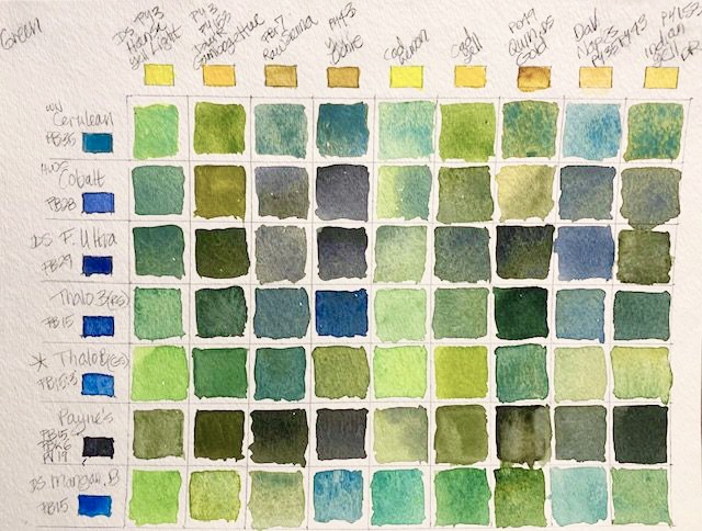
The color green is made of blue plus yellow (plus a small amount of red to tone the color down if you want to naturalize it). To create some greens, take every yellow on your palette, and combine each with the blues you have. Note that mixing a COOL yellow with a COOL blue creates a bright and vibrant green (for example, Hansa Yellow Light with Winsor or Phthalo Blue). By mixing a WARM and a COOL, or two WARM colors, you get duller, less intense greens – because both the warm yellow and blue have some red in their pigment. To further fine-tune your mixes, vary the proportion of each chosen pigment. More blue in the mix will cool and darken the resulting green, while more yellow will warm and brighten it.

Greens Mixed With Various Combinations of Blue and Yellow.
GREENS ANOTHER WAY.
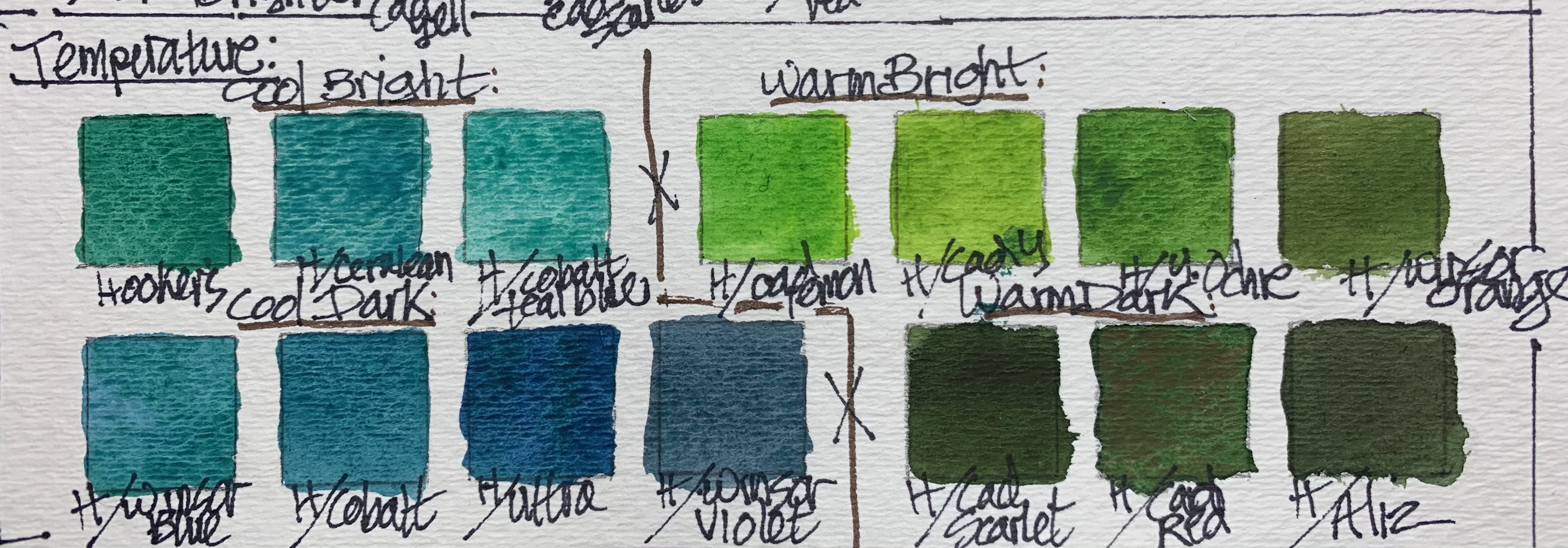
It is also possible to create natural greens by using ready-mixed tube green as a starting point but then adding other pigments to it. Tube greens tend to be very intense, but can be adjusted with another color to make them brighter, warmer, cooler, or darker. Choose a tube green close to the general green color of your subject, then mix in a touch of one of the colors close by on either side of the color wheel (in the chart below, Winsor Yellow and Ultramarine have been added to DaVinci Sap Green, Hooker’s Green, and Viridian).

In the chart below, Hooker’s Green has been used as the starting green. Other pigments have been added to it to vary the color temperature and create cool bright, warm bright, cool dark, and warm dark variations.
A TRICK TO VARY PROPORTIONS OF COLORS.
You can create even more mixtures by changing proportions of each color in the mix. Catherine Gill in Powerful Watercolor Landscapes (2011) describes a very effective technique for mixing numerous related colors by changing proportions in a mixture. She makes a “mixing trail” (p. 122), using two colors on her palette. Instead of mixing two colors together in the beginning, she puts the two colors on her palette, leaving a space between them. She suggests you take a little of the first color and mix it with the second. Then, take successive amounts of the second color, and mix with the first until you have several distinct hues. The space between the two colors is the area where you make the “trail.” The colors will all be close in value because you haven’t picked up ANY water in this mixing technique.
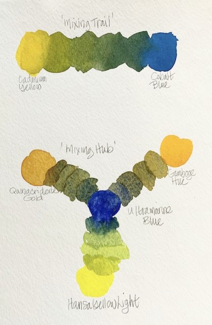
Catherine Gill also describes a “mixing hub” (p. 123), which is a collection of mixing trails laid like spokes around a central pigment. The hub allows you to create a variety of related colors. The hub pigment is in all the mixes of the hub, ensuring color harmony. And again, since you add no water as you create the mixes, values remain constant.
CHOOSE SOME FAVORITES.
To simplify mixing greens somewhat, you can think of five basic green mixtures to rely on, as suggested by Bruce MacEvoy (on handprint.com). A BRIGHT green could combine Phthalo Green Yellow Shade (PG 36) and Hansa Yellow (PY 97). A COOL green could combine Prussian Blue (PB 27) and Phthalo Green Yellow Shade (PG 36). Combining Prussian Blue (PB 27) and Hansa Yellow (PY 97) produces a LIGHT green. WARM green comes from combining Phthalo Green Yellow Shade (PY 36) and Burnt Sienna (PBr 7). Finally, put together a DULL, DARK green with Phthalo Green Yellow Shade (PG 36) and Quinacridone Rose (PV 19).
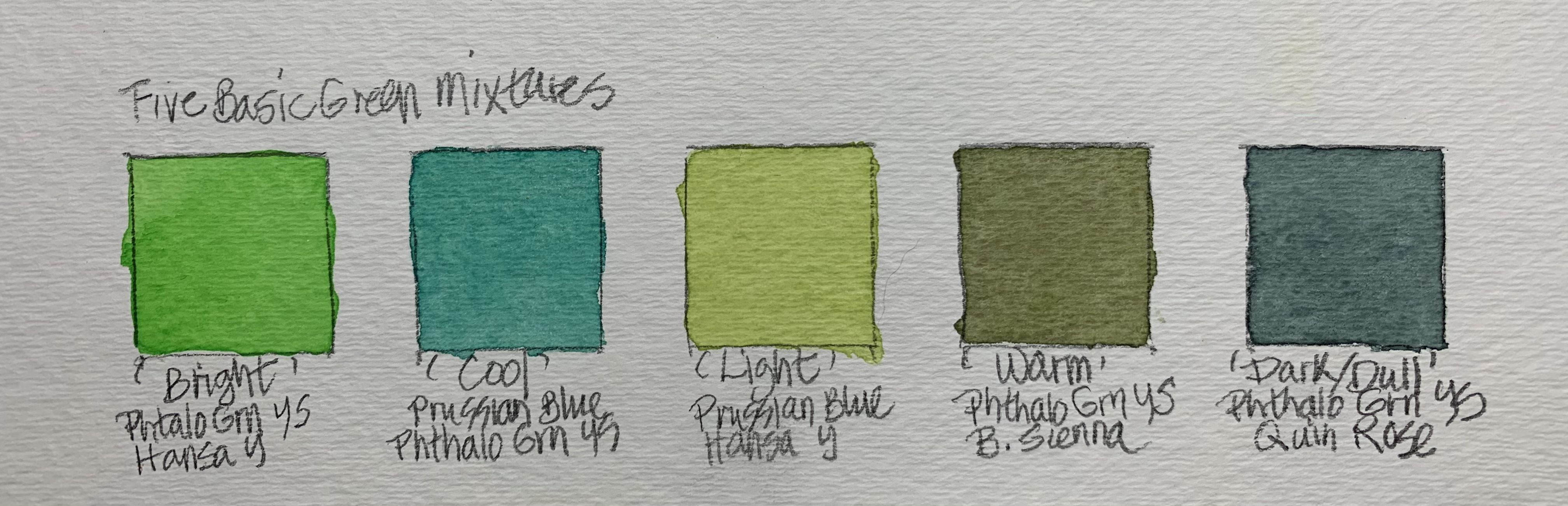
A Set Of Five Basic Green Mixtures.
CREATE YOUR OWN MIXES TO DEPEND ON.
With experimentation, you will find many mixtures that work for you. Make a chart, for handy reference, of your favorite mixtures.
Condensed Chart of Favorite Green Mixes.
HOW YOU MIX WILL AFFECT RESULTS.
Finally, the way you apply your pigments to paper can alter the appearance of your greens and foliage. The first option you have is to mix your color ON THE PALETTE before you apply it to paper. A second option is to apply separate colors TO YOUR PAPER, allowing them to mingle on your paper. This technique creates a more varied, dynamic color mix. Third, you could GLAZE one color over a DRY wash of another color. Glazing and layering are similar processes. They both change appearance and value. Glazing uses a very thin, transparent wash of one color over another color. When warm colors lie below a cool glaze, the resulting color mix is luminous, vibrant, and glowing. Starting with a cool color and putting the warm color on top gives a heavier, denser glaze.

“Apples” Watercolor using a variety of mixed greens.
Finding a variety of natural greens to paint convincing foliage can be confusing and frustrating. It can also be fun! As painters, we know that ready-mixed greens are not sufficient. Therefore, take some time to experiment with all the yellows, blues, and greens on your palette, adding touches of red to some of your mixtures. Make a chart of your favorite blends for handy reference. Experiment, and enjoy!
Join me and get painting tips, inspiration, recent art news, or information about new art or products for sale, sent to you by email. Subscribe here. I’ll give you a free copy of my Color Blending Tips pdf. that you can download and print.

Wow, really good suggestions here! I’ve heard that Pyrelene green is a natural cool gray green but I don’t own any myself. I tend to use Deep Sap green mixed with ultramarine to get a nice cool green, that’s my favorite but I need more mixes in my memory for fast landscapes, so I thank you for the ideas. 🙂 🙂
LikeLike
You’re welcome, Sandra!
I LOVE Perylene Green (also called Shadow Green by Holbein) – it’s a very attractive color as it is AND good to make a dark mix with, probably because it has a black pigment in it (PBk31). Green Gold (or Rich Green Gold)
is another favorite – it really brightens and highlights other greens.
What brand is your Deep Sap Green? (Different brands offer really different takes
sometimes.) I’d like to check it out.
Thanks for commenting! I look forward to you checking in again.
Lee
LikeLike