Tree color is dependent on several factors. Never depict trees in your paintings as all the same color – a strong, unvaried green – because you “know” what color trees are. Tree color varies with the type of tree (species), the season, and the distance from the viewer. You should look for blue/greens, yellow/greens, and red/greens. Your work will be far more interesting if you include and even exaggerate these variations in color, paying special attention to the cooler, darker hues of the shadowed areas which appear on the side of the tree away from the source of light and on the undersides of the branches.
Spring trees display fresh, bright foliage. Make the foliage translucent by mixing your colors with plenty of water, and try to keep your shapes well defined. Leave lots of white paper showing between foliage shapes to suggest sparse, new growth. Lemon yellow or Hansa yellow light with sap green would work well for creating bright greens and yellows. Remember to paint foliage in at least two layers (light and dark). For spring trees in the distance, strive for cooler greens by adding blue to your mixtures; the blue will complement the warm, bright colors of nearer trees. A good reference for seasonal paint colors is my blog of 11/27/2018, entitled “Spring, Summer, Autumn, and Winter Palettes.”, https://leemuirhaman.com/2018/11/27/spring-summer-autumn-and-winter-palettes/.
Summer trees look more solid and richer in color than spring trees. The foliage is fuller. Build up the summer tree in two or three layers, starting with the outline of the canopy. DaVinci Sap Green and Ultramarine Blue work well for summer foliage, with perhaps Payne’s Gray added for the darkest parts. Remember to leave a gap or two for sky holes.
Autumn trees have somewhat less foliage than summer trees, and as the season progresses, the trees will, of course, drop more and more leaves, and foliage will become sparse. Autumn colors are rich and warm: siennas, reds, and yellows develop, and a few greens linger. More branches are visible. In bright sunlight, your autumn tree will appear somewhat paler than you might expect. Try to mix your colors on the paper, dropping in several colors next to each other and allowing them to blend softly into each other on their own. Trees are seldom a single color. A variegated wash of Cadmium Yellow and Light Red with a touch of DaVinci Sap Green could be used to make a range of fall colors.

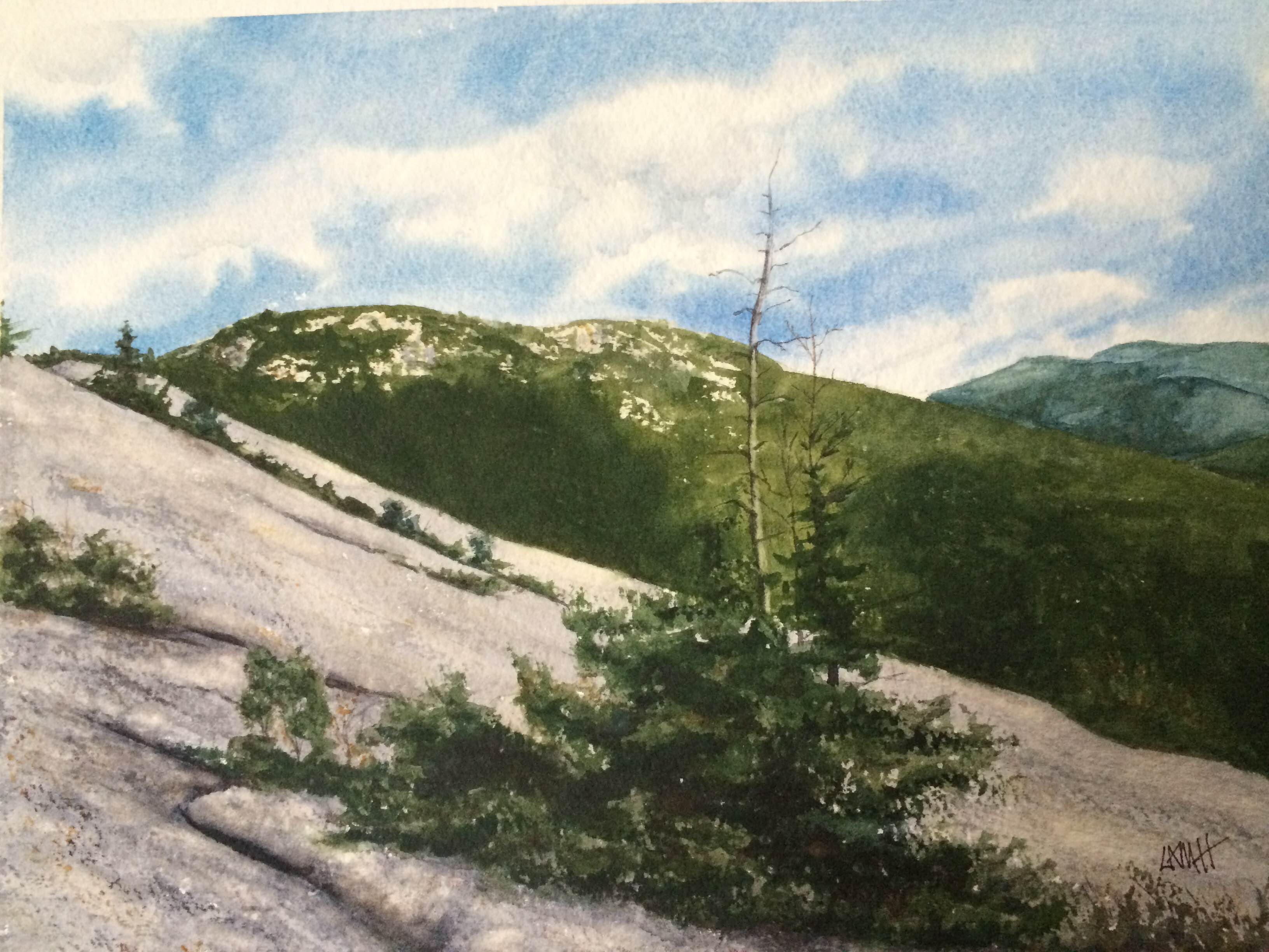
Conifers have a somewhat different structure and shape than deciduous trees. To paint conifers convincingly, you must take notice of their structure. You don’t want to paint Christmas trees! Conifers develop around a single central trunk. Look closely to get the angle of the branches correct. In general, limbs grow up and out. More specifically, branches at the top of a conifer head upward, those in the midsection go outward, then head upward, and those near the bottom head downward, then upward. Remember: all the branches are heading for sunlight. Coniferous branches tend to be shorter and most branch out flatter than deciduous branches. Try to leave space between many of the branches.
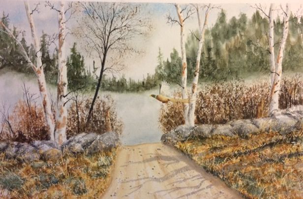
White paper birches are tall, thin trees found in the Northeastern United States, growing singly or in clusters. The trunks tend to be thinner than those of many large trees, with only a few large limbs but many smaller horizontal branches and flexible twigs. The bark of the birch tree is paper-like and chalky white, sometimes peeling, broken with irregular horizontal textures and dark scars. Larger branches are white, but the smallest branches appear black. When you are painting birch trunks, brush strokes, shadows, and bark texture should follow circumferential lines, using blacks and grays (mixed by combining Ultramarine Blue with Burnt Sienna) and a brownish orange (made from Burnt Sienna).
You should paint distant trees as simple masses of shapes with minimal detail. Squint your eyes to observe shapes and groupings of light and dark areas. The farther away the trees, the paler and less detailed they become. Distant trees also have a cooler (bluer) color. As you move from the horizon to the middle ground, you can very gradually warm up your colors by putting more yellow and less water in them. However, you still need to reserve your richest greens and strong contrasts for foreground trees.

Many of the previously mentioned details about trees may seem obvious or overly simplistic, but a lot of beginning painters do not paint with these many small details in mind. Attention to such details helps you paint convincingly and accurately. Details are important!
Join me and get painting tips, inspiration, the latest news about classes, new art or products for sale, sent to you in my newsletter. Subscribe here. I’ll give you a free copy of my Color Blending Tips pdf., that you can download and print.

2 Comments