Nature’s colors can vary considerably depending on the time of day, the weather conditions, and the season. The effects of the time of day and the weather on color changes and atmosphere seem more obvious and easier to observe than the effects of the season. Nevertheless, each season has its own characteristic feel and look, which an artist’s choice of paint colors can convey.
SPRING colors tend to be cool. Spring is a time of fresh growth, when buds and flowers burst forth. Forest floors are becoming free of frost and snow, and bright green shoots begin to appear.
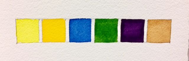
Hansa Light, Cad. Yellow, Winsor Blue, Sap Green, Permanent Mauve, Raw Umber.
Cadmium Yellow can be a bright spring color, especially when a little Hansa Yellow Light ( or Lemon Yellow or Cadmium Yellow) is mixed in. The cooler blues to use are Cobalt and Winsor (or Pthalo) blue. DaVinci Sap Green has a strong blue (cool) tinge. Other possible colors for a spring painting include Permanent Mauve or Raw Umber.
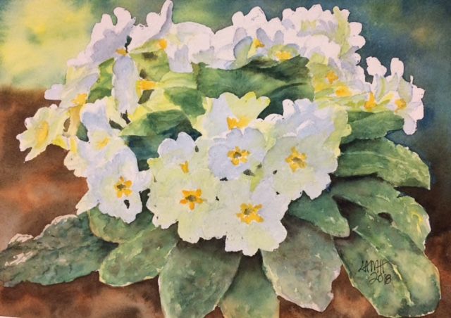
Spring pictures:

Sunny days of SUMMER are filled with golden warmth and numerous, lush greens. The summer palette includes warmer colors than the spring palette.

Cad. Yellow, Raw Sienna, Burnt Umber, Ultramarine, Sap Green, Perm. Aliz. Crimson.
Raw Sienna is a warm yellow. Cadmium Yellow mixed with DaVinci Sap Green is an excellent mix to use for summer foliage. The sharp, cold light of spring has been replaced by softer summer light, creating softer-edged rather than crisp shadows. Create a softer edge by painting summer shadows on damp paper or lightly blotting the shadow edge. Ultramarine Blue and a touch of Permanent Alizarin Crimson make a warm summer shadow. (Another possible color combination for a warm shadow mixture is Ultramarine Blue with a touch of Burnt Umber.)
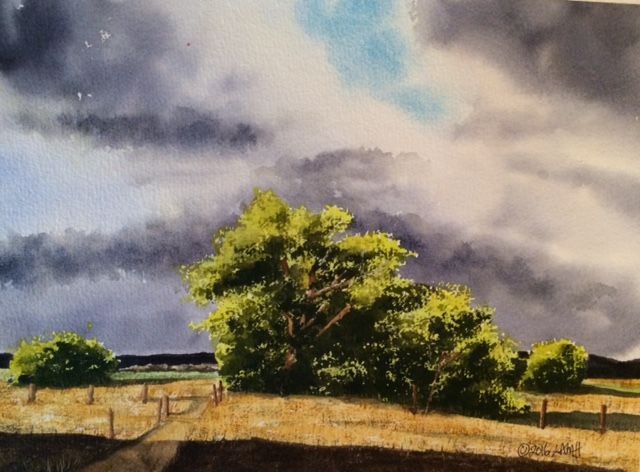
Summer pictures:

AUTUMN is the season of reds, oranges, golds, and browns.

Cad. Red, Cad. Yellow, Raw Sienna, Ultramarine, Burnt Sienna, Burnt Umber.
Rich, warm colors can be created with warm golds and siennas, such as Raw Sienna, Burnt Sienna, and Burnt Umber. Fiery reds made with Cadmium Red and golden yellows made with Cadmium Yellow light up the foliage. When the leaves fall, stark and skeletal trees are revealed in deep browns, which can be approximated with various combinations of Burnt Umber and Ultramarine Blue.
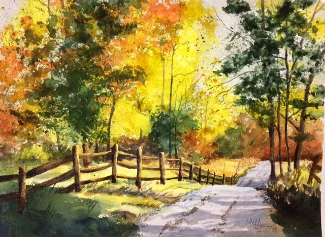
Autumn pictures:

A WINTER palette would be composed of cool colors and more neutral pigments, mixed to produce slightly muted tones, often tinged in gray.
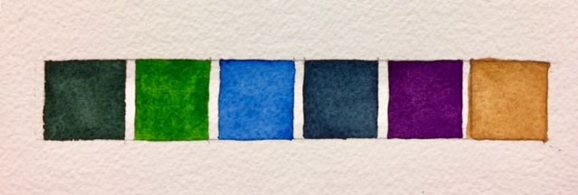
Perylene Green, Sap Green, Winsor Blue, Payne’s Gray, Perm. Mauve, Raw Umber.
DaVinci Sap Green and Perylene Green (or Holbein Shadow Green) can be used as a base for any greenery. Alternatively, try blending Winsor Blue (or Pthalo Blue) with Payne’s Gray and mixing in some DaVinci Sap Green. For snow, leave the paper white and paint around it. Snow does have some color, depending on the strength of the steely winter daylight. Snow shadows could be blended from Cobalt Blue and Permanent Alizarin Crimson into a cool, blue-violet. Another blue-violet snow shadow combination might be Winsor Blue (or Pthalo Blue) and Permanent Mauve. Raw Umber can be useful to tone down trees, branches, and ground covers.
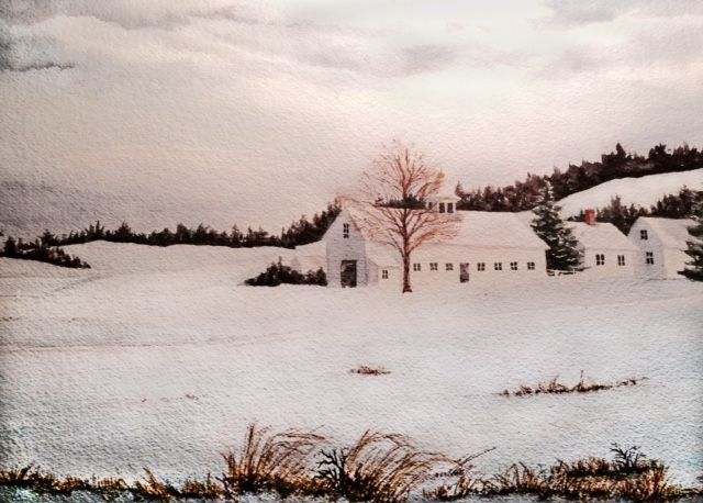
Winter pictures:

The main tool that any painter has to work with is color, and by choosing pigments with different temperatures, tones, and intensities, an artist can suggest both warm and cold environments throughout the seasons.

2 Comments