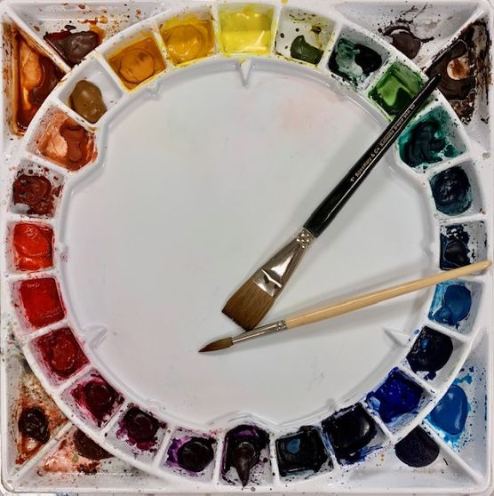
I recently wrote about the advantages of arranging your watercolor pigments in a color wheel format. ( See my blog post published January 28, 2020, entitled Have You Seen The Painting Palettes From Robax?, https://leemuirhaman.com/2020/01/28/have-you-seen-the-painting-palettes-from-robax/). In today’s post, I will help you choose which colors to fill your circular palette.
UNDERSTAND THE COLOR WHEEL.
The basic color wheel contains the three ‘primary’ colors (red, yellow, and blue) and various intermediate colors which can be mixed from those primaries. ‘Warm’ colors (yellow-green through red to red-violet) are on one side of the color wheel, while ‘cool’ colors (yellow-green through blue to red-violet) are on the other side. For a quick review, read the July 2, 2019 blog post The Color Wheel, Color Bias, And Color Mixing In Watercolor., https://leemuirhaman.com/2019/07/02/the-color-wheel-color-bias-and-color-mixing-in-watercolor/.
The color wheel enables painters to recognize ‘complementary’ colors, direct opposites on the color wheel, more easily. Such complements are red and green, orange and blue, yellow-green and red-violet. If you add a bit of a color’s complement (e.g., a bit of red to a green wash), the color will be grayed and start to lose its intensity. When mixed together, complementary colors produce grays and browns. The three primaries mixed together will also create grays.
COLOR TEMPERATURE AND BIAS.
Few paint colors can be described as a pure, neutral color. This is ‘color bias’ – that is, most paint pigments are not perfect spectrum hues or colors, but contain some amount of another color. A warm red contains some yellow – it ‘leans’ toward and is biased toward yellow, whereas a cooler red would have more blue and would lean toward blue, or have a blue bias. In general, all (grayed) dulled COOL colors are warmer than their original hue, and dulled WARM colors are cooler than their original hue. For example, a grayed Blue-green (as described by Bruce MacEvoy on the “Color Theory: Color Temperature” (c. 2015) page of the handprint.com website) is warmer than a saturated Blue-green, because some Red-orange has been mixed in with the Blue-green in order to gray it. Also, Burnt Sienna is cooler than Cadmium Scarlet, because it is less saturated (closer to gray). Similarly, Ultramarine Blue becomes grayer (and warmer) when Burnt Sienna is added, while Burnt Sienna is made cooler by adding some Cobalt Blue.
WHY DOES COLOR BIAS MATTER?
Why does color bias matter in painting? Color bias affects how a pigment mixes with other paint colors!!!
Arranging your paints ACCURATELY in the color wheel format will suggest whether a specific color ‘borrows’ or is ‘biased toward’ any yellow, red, or blue from the neighboring primaries. This color characteristic (color bias) starts to tell you what to expect during color mixing. See the related blog post Adjust Your Color Thermostat!, November 12, 2018, https://leemuirhaman.com/2018/12/11/adjust-your-color-thermostat/.
You CAN’T pick any yellow to mix with any blue and expect to get a desired green. A cool yellow (with a blue bias) will behave very differently in a color mix than a warm (red bias) yellow.
You will need both a warm and a cool of each primary color to mix color effectively!
WHERE DO THE COMMON WATERCOLOR PIGMENTS FIT ON THE COLOR WHEEL?
Colors are arranged on the color wheel according to their relationship to each other and their temperature. The three primary colors are spaced evenly on the wheel. When the primary colors are mixed, they create secondary colors; these are placed between the two colors that they were mixed from because they contain some of both colors. Continue mixing, for instance, a secondary with the neighboring primary, and that color, a tertiary, is placed between the two colors used to mix that particular color. And so on.

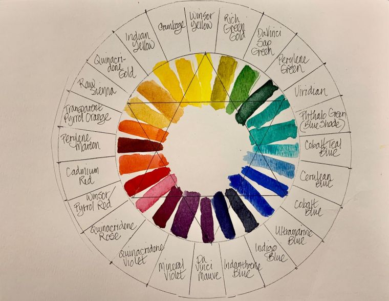
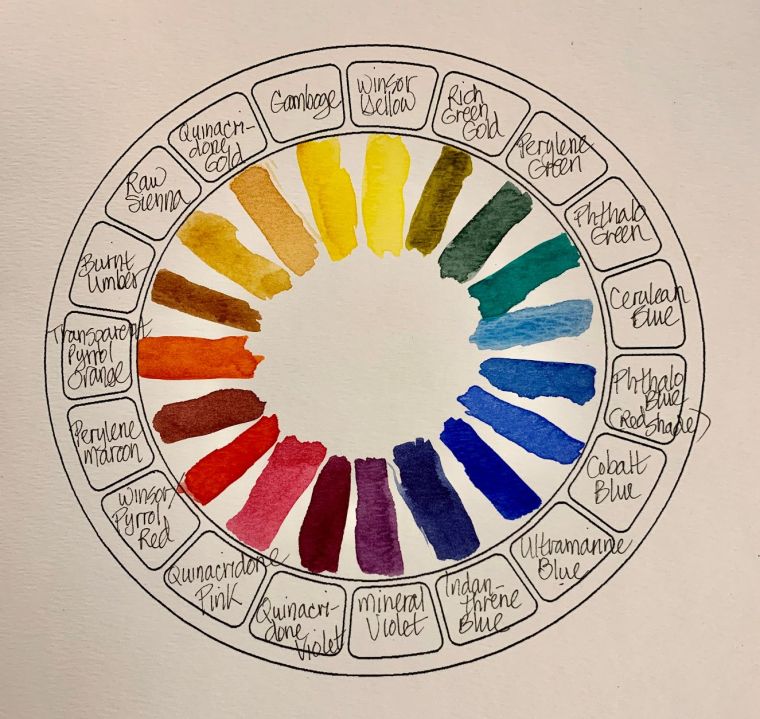
Now, let’s look for the pigments to place in our circular palette. We should choose our warm and cool primary colors. Keep in mind that the options are many. To begin, however, choose just ONE in each category below. Possibilities include:
COOL YELLOW: Winsor Yellow, Lemon Yellow, Hansa Yellow Light, or Aureolin.
WARM YELLOW: Hansa Yellow Deep, New Gamboge, Nickel Azo Yellow, or Indian Yellow.
COOL RED: Quinacridone Rose, Permanent Rose, or Permanent Alizarin Crimson.
WARM RED: Cadmium Red, Permanent Red, Pyrrol Red, Light Red.
COOL BLUE: Phthalo Blue, Winsor Blue, Prussian Blue, Antwerp Blue.
WARM BLUE: Ultramarine Blue, Cobalt Blue, Indanthrone Blue.
Next, we need to fit in secondaries between the primary colors.
COOL ORANGE: Cadmium Orange, Brilliant Orange.
WARM ORANGE: Pyrrol Orange, Permanent Orange, Burnt Sienna.
COOL PURPLE: Mineral Violet, Permanent Mauve, Quinacridone Violet.
WARM PURPLE: Quinacridone Violet, Cobalt Violet.
COOL GREEN: Phthalo Green, Winsor Green, Viridian, Cobalt Green.
WARM GREEN: Sap Green, Green Gold, Olive Green.
This will give you TWELVE colors to space around your color wheel palette. Depending on the number of wells available in your palette, you can add or adjust your colors. Try to remember, however, that your goal is to approximate a color wheel on the palette. In other words, don’t stick a new color wherever there is an open space; instead, try to place it along the continuum of color temperature, close to similar colors. For instance, Quinacridone Gold is a WARM YELLOW and should be placed alongside Indian Yellow and Raw Sienna.
POSSIBLE PALETTE ARRANGEMENTS:
HOW TO MIX? SOME COLOR MIXING SUGGESTIONS.
I’ve got a newsletter now! Subscribe here. I’ll give you a free copy of my Color Blending Tips pdf., that you can download and print.
To mix a BRILLIANT, clear color, you must choose your primary colors carefully! Use two colors that are AS CLOSE AS POSSIBLE to each other on the color wheel. To mix a pure purple, choose a blue pigment with some red in it (Ultramarine) to mix with a red that leans toward blue (Permanent Alizarin Crimson). Because the blue contains red and the red contains blue, your mix will be bright.
On the other hand, if you combine Winsor Blue (which contains some yellow) with Cadmium Red (which also contains yellow), a DULL purple will result. Both the blue and the red, in this case, contain some of the complement of purple (yellow), thus graying the final mixture.
Similarly, you could mix Hansa Yellow Light (or Winsor Yellow) with Phthalo Blue (or Winsor Blue) to create a bright, spring green. Or combine Quinacridone Gold with Ultramarine Blue to achieve a warm, olive green. Try some of your own combinations! What red and yellow would you try mixing together to create a bright, clear orange?
(For more specifics, see my related blog published 11/27/2018, entitled “Spring, Summer, Autumn, and Winter Palettes.”, https://leemuirhaman.com/2018/11/27/spring-summer-autumn-and-winter-palettes/).
To avoid mixing ‘muddy’ color use transparent pigments; they will NOT produce mud IF mixed with other transparent colors. By adding one (or more) opaque colors to a paint mixture or layering with an opaque pigment, however, you will be making ‘muddy’ color more likely. Try to combine opaque paints only with a transparent color or colors, if possible.
See the blog post Why Does It Matter If My Paint Is Transparent Or Opaque As Long As I Like The Color?, published November 26, 2019, https://leemuirhaman.com/2019/11/26/why-does-it-matter-if-my-paint-is-transparent-or-opaque-as-long-as-i-like-the-color/ to learn more about opaque pigments and how they behave.
IN SUMMARY.
Depending on the specific choices of paint, a whole range of possibilities exist for creating color. Change one ingredient in a mixture to achieve different results. Remember, to create a brighter mixed color, use two colors biased TOWARD each other on the color wheel (e.g., a yellow situated closer to the blues mixed with a blue situated closer to the yellows) to avoid adding any of the third (red) primary color (which would gray the mixture). Knowing the color wheel doesn’t necessarily allow you to predict exactly what each paint or mixture will do. Although it gives you a step ahead, you will still need to experiment and learn from experience! Color mixing is fun, yet not an exact science.
I’ve got a newsletter now! Subscribe here. I’ll give you a free copy of my Color Blending Tips pdf., that you can download and print.

1 Comment