As artists gain experience in watercolor painting, they become aware that different colors have more or less “warmth” or “coolness.” Colors on the color wheel can be grouped into two families: warm (reds, oranges, yellows) and cool (violets, blues, greens). Furthermore, each color has a warm or cool bias (whether it is cool or warm itself) depending on the amount of its neighboring color that it contains. Adding red or yellow to an existing color will warm it up; adding blue will cool it. When you are comparing two hues, the hue closer to yellow on the color wheel will be the warmer of the two (for instance, Cadmium Red is warmer than Permanent Alizarin Crimson). The color closer to blue on the color wheel will be the cooler (for instance, Aureolin or Lemon Yellow is cooler than Cadmium Yellow). When a cool color and a warm color are placed near or next to one another in a picture, they can also BIAS or INTENSIFY each other. Thus, a cool blue feels even cooler next to a warm color, or a warm yellow feels even warmer near a cool color. If you want a feature of your painting to stand out, paint cool colors surrounded by warm colors or warm colors in a cool area.

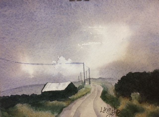
This temperature relationship allows colors, including grays, to be PUSHED or PULLED to add visual interest or depth to a painting (Making Color Sing by Jeanne Dobie, p. 30). “Pushed or pulled” refers to the use of RECEDING cool or ADVANCING warm colors. Pushing color into a cooler version of itself causes it to recede while pulling a nearby color into a warmer color makes this nearby color advance. Armed with this knowledge, painters can create distance in a painting: the receding color and advancing color can be made to appear on different planes. For example, to describe distance in a landscape painting, artists can “push” the background back by using cooler tones as features of the landscape disappear over the horizon. Thus, far hills often look more blue or purple instead of green. Also, the foreground can be “pulled” forward with warmer colors.

Difficulty can arise, however, if artists assume that all yellows, for instance, are warm or all blues are cool. The temperature of a color is always relative, because it depends on nearby colors. You must judge color temperature by surrounding colors. Ultramarine Blue viewed next to Cadmium Red appears cool indeed, yet the same Ultramarine Blue next to Lemon Yellow or Permanent Rose will seem warm.
Another complication in using color well involves observing how light and atmosphere change local color (the actual, basic or local color of an object). Artists should consider how conditions in the scene affect local color. Snow shadows are not always blue and may even be golden or rosy at sunset. A gray road drenched by rain may take on a purplish cast. At sunrise a brown tree trunk may have a golden glow. Try to use warm and cool colors to intensify the atmosphere in your picture.
Artists often use shading or modeling layers of color to create the effect of three-dimensional shape on painted objects. In deepening a shadow by adding darker layers, however, you may dull or deaden color; instead, use the warm-cool interaction to achieve similar results while keeping colors luminous. With an understanding of the “push-pull” of warm and cool colors, you can begin to form volume through color alone, creating the illusion of three-dimensional space in a painting.
Paint your object the local color first. Then find your light source to determine what is in shadow. One side of your object will be away from the source of light and in shadow. If the local color of your object is warm, you can use cool values like blue to shadow. The object will seem to TURN AWAY from the light and have two sides. If the local color of your object is cool, then use a warm color on the side away from the source of light. (When glazing on the second [shadow] color, make sure the first color is dry before adding the second layer.)
To be effective with warm-cool interactions, artists must be aware of the light source and whether this light itself is warm or cool. A warm light source affects a subject differently than a cool light source. To create volume through color alone, you will need to handle each lighting condition somewhat differently.
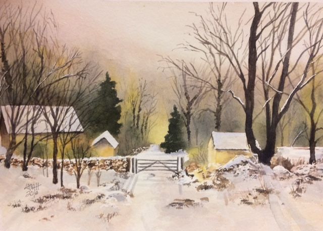
On bright, sunny days, the sun bathes objects in warm light while casting cool shadows. Paint a pine tree on a sunny day with predominantly warm colors such as Sap Green mixed with Cadmium Yellow, with a touch of Cadmium Red. The cool, shadowed side of the tree could be Sap Green cooled with Ultramarine Blue or Permanent Alizarin Crimson. On an overcast day, the light areas of the pine might be a cool mixture of Viridian and Permanent Rose plus Cobalt Blue. The warm shadow could be mixtures of Sap Green plus Transparent Red Oxide with small amounts of Cadmium Red or even Permanent Alizarin Crimson. Artificial indoor lighting is usually warmer than outdoor light which is often affected by cool reflections from the sky.
When colors are in close proximity, they tend to exaggerate each other’s differences. Complementary colors have contrasting temperatures. Using the “push-pull” of warms and cools can help to create depth in a painting by moving objects forward or backward in space, as well as creating the illusion of three dimensions.

Great article & lovely artwork. Thank you, Lee.
LikeLiked by 1 person
You’re very welcome! Thanks for commenting.
LikeLike
Lee, Absolutely fantastic & informational!! Just read Your color wheel and color bias plus Adjust Your Thermostat. Both are the most comprehensive color mixing & color theory articles I have read. It really brought ALL the little bits of info together for me. You have me excited to now put it into practice. Am also loving the artwork and examples, Are all of these your artwork? I’m looking forward to dive deeper into your site and grateful to stumbled across you. Thank you so very much.
LikeLike
You’re very welcome. I’m so glad my articles had information that you found helpful! It’s great to hear that the writing is clear and comprehensive. You made my day!
How did you find me?
All of the watercolors are mine, yes. Other painters are given credit when I happen to highlight their work, such as the oil painting at the end of the 6/19/2020 blog “Let’s Get Shady”, https://leemuirhaman.com/2020/06/19/lets-get-shady/. Photos might not be mine, although many are. (One of my sons contributes a lot of his photos.)
LikeLike