Why are there such variations in the appearance of shade and shadows, even within a single picture? How, as artists, can we capture that variation with paint? Why do some shadows have hard edges and others appear soft? Why are some shadows darker than others? Read on…
Value.
We know that mastering light and shadow is key to successful watercolor painting. By using VALUE (light and dark) a painter can give an object shape, form, depth. PATTERNS of light and shade are, in effect, what we are actually trying to capture in paint.
Light Source.
When beginning to paint, an artist needs to consider where the light is coming from, the LIGHT SOURCE. The way light hits an object affects how it is seen and how it will be painted. Are you painting a bright sunny day, a dark overcast day, or a gloomy interior, for example? Light affects mood, and will determine the types of shadows you need to paint. Beginning painters sometimes try to avoid painting shadows, but then wonder why their image looks flat and incomplete. Shadows create form – add shadows to a drawing of a circle and it becomes a rounded sphere. So, at the outset, analyze how and where the light strikes an object. (Keep in mind that there may even be more than one light source!)
Complexity!
Initially, shadows may look as if they are made up of only two values, light and dark. But look more carefully and you will see a much more complex reality.
Shadow components.
Break down a shadow and you will find many components. The HIGHLIGHT is the area hit directly by the light source. There is often little or no detail visible here, as it is too bright. Paint a highlight with a very pale tone or leave the white of the paper.
The area of an object that is transitioning from the highlight to the darkest shadow area is called the HALFTONE. If the object is curved, as a sphere or rock, this transition of value is gradual, and would be painted with a soft edge.
The actual SHADOW (sometimes called a LOCAL or FORM shadow) will be in the area of the object that is hidden away from the light. It is generally the darkest area, receiving the least amount of light. Shadows are dark, but rarely black! To mix shadow color, you might mix the local color of the object with some transparent blue (sky light) and some of the local color’s complement.
Often, light can be reflected back into the shadow, illuminating it. This REFLECTED LIGHT bounces off a nearby surface and carries some of the color of that surface into the shadow. Reflected shadows would be lighter than the actual shadow, but never as bright as an area directly in the light. The amount of color reflected depends on the intensity of the light source as well as the character of the surface reflecting the light. Observe carefully how much reflected light you see in shadows and what colors are introduced there.
A CAST SHADOW is created by the object interrupting the light, and its shape relates to the shape of the object and the ANGLE of the light source. The cast shadow will follow the contour of what it falls on, for example, uneven ground. It will grow LIGHTER in value and softer-edged the farther it extends from the subject casting the shadow. The darker and harder-edged you paint cast shadows, the brighter the light will appear. Choose clear blue shadows for sunny days, whereas on overcast days, a cool gray or grayish purple would be a more appropriate choice for shadows. As the weather and quality of light in the sky changes, so do the color, value, and edge qualities of the cast shadows.
Wet-in-wet is an ideal technique to introduce color into a still wet shadow. You might paint a base shadow wash in a lighter tone than your final desired value, then drop in additional colors, each successive color mixed to a somewhat drier consistency than the previous ones (to avoid over-wetting and creating pools of paint). Don’t overmix colors when you add them into a shadow, which would create a dull uniform gray that appears flat. You want to retain separate colors and variation of color within a shadow. Remember to use transparent colors in your shadows if your aim is to deepen and darken the shadow. On the other hand, bright opaque pigments, such as yellow ochre or raw umber, could lighten the shadow and suggest reflected light. You might also lift out patches of color to build lighter spots of dappled light, or reflected light.
Hard or soft?
Several factors affect the softness/hardness of shadow edges. We know the SOURCE of light changes the appearance of shadows. With a single bright light source, such as the sun, shadows will be strong and sharp. Diffuse light, on the other hand, such as through a window out of direct sunlight or on an overcast day, produces shadows less defined and with soft edges. In diffuse light, value contrasts will also be less strong.
So, sharp edges and details are found in well-lit areas, whereas soft or lost edges and ambiguity are located in the shadows. It doesn’t make sense, for instance, to try to paint sharp, crisp details in darkened, poorly lit room. Instead, blur or soften details in shadow, even painting shadowed areas wet-in-wet on dampened paper with a passage of mingled colors. (Remember to dampen as evenly as possible, however, to avoid puddles or pools of water. Don’t flood the area with lots of water. Pre-wetting evenly encourages a soft blend of paint.) Leave your paper dry where you want to retain details, perhaps under bright lamp light.
Also, the DISTANCE FROM THE OBJECT casting the shadow to the shadow itself also has an effect on whether shadows are hard or soft edged. Where the shadow lies close to the object, such as plants in a flowerpot casting a shadow on the ground, the shadow will tend to be crisp and dark. A tree, farther away from the ground, will cast a lighter, softer shadow, since as the distance increases, more light is able to reach the shadow.
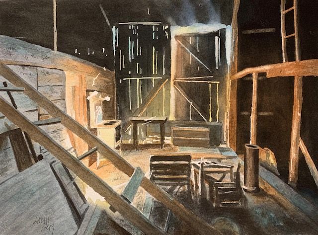
Try to apply what you just learned in this blog post about shadows. Take a look at this Kenny Harris painting (below) and see if you can analyze and make sense of the many and varied shadows.
Join me and get painting tips, inspiration, the latest news about classes, new art or products for sale, sent to you in my newsletter. Subscribe here. I’ll give you a free copy of my Color Blending Tips pdf., that you can download and print.

I love your description of shadows. It gives pause to think it through, rather than just use plow into it. Very nice.
LikeLike
Yes, shadows are more complicated than they at first appear! There are many variations of color, edges, AND value within the shadows, and looking carefully makes sense. The more you look, the more you see!!!
Thanks for your comment! I hope this blog post will help you when you look into beautiful shadows. Lee
LikeLike