Every color has three different components. These qualities are value (lightness or darkness), hue (the color name), and intensity (saturation or brightness). Each brushstroke in a watercolor painting is affected by all three aspects of color, although usually the properties are discussed and adjusted separately. By manipulating value, hue, and intensity in a painting, you will be able to create the illusion of space and three dimensions as well as create art filled with feeling.
COLOR VALUE.
I have heard it said that VALUE (a color’s lightness and darkness) is the most important of these three elements of color to get right in a painting. Value helps to create form and to show the direction of light. In order to better see value in a scene, squint your eyes. Squinting allows less light to reach your eyes and will reduce both the color (hue) and detail you see, making it much easier to isolate light and dark values. Even when squinting, you will probably see many values ranging from black through a range of dark to light grays to white. Trying to capture every one of these variations in paint, from dark to light, would be too overwhelming. It is best to simplify; narrow down the number of values you plan to capture, and limit yourself to 3-5 values for ease of painting. For example, limit your choice of values to darkest dark, lightest light, and one or two mid-tones.
One method of achieving the desired value of your color, is to mix the right amount of water with the right amount of paint. If you add more water to a watercolor mixture, you get a lighter value. If you instead add more pigment, you create a thicker, darker mix. The thickness of your color mix relates to its value.
Further, you can create the desired value of a color by first choosing the right pigment for the value you want. Catherine Gill, in Powerful Watercolor Landscapes, pp. 120-121, suggests, “If you want a light value, choose a transparent pigment. For a middle value, choose an opaque. For a dark value, choose a stain.” You still must adjust the amount of water you use. For a light color using a transparent pigment, use more water. For achieving middle value color, make a thicker mixture with an opaque color. An even thicker mixture made with a staining color will produce a dark value.
HUE.
HUE is the name used for a color. Red, yellow, and blue are hues. An almost infinite number of hue variations are possible, from yellow-green to turquoise to blue-violet. When we talk about hue, we are NOT referring to light or dark, bright or grayed, or strong or weak. To better understand how hues (colors) relate to each other, learn about the COLOR WHEEL. Each hue has its own specific placement on the color wheel, depending on its similarities and differences to other hues.
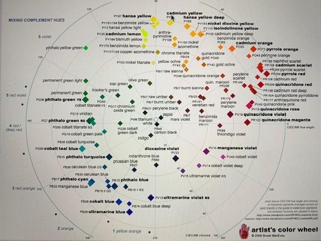
Hues located close to each other on the color wheel have more similarities; they contain more of the same primary color than hues located farther from each other. Nearby hues are harmonious and analogous. In contrast, those hues located farther away from each other on the color wheel are less closely related. Two hues opposite each other on the color wheel have little in common; they are complements. If mixed together, complements create a neutral, grayed hue, whether gray or brown. When complements are painted side by side in your painting, they contrast strongly and can emphasize each other.
HUE AND TEMPERATURE.
COLOR TEMPERATURE, whether a color is warm or cool, is a characteristic of hue. Every color leans either toward warm or cool. On the color wheel, cool colors are grouped together (blue, green, violet). Warmer hues (red, orange, yellow) are located together on the opposite side of the color wheel. While yellow is generally a warm hue, some yellows are cooler than others. For instance, a Cadmium Lemon pigment is cooler (closer to blue on the color wheel) than warmer (more orange) Cadmium Yellow. Cadmium Red is warmer than Permanent Alizarin. And Sap Green is warmer than Hooker’s Green, which is warmer still than Viridian. Thus, even within a hue, you will find a variety of temperature differences. You can warm a hue by adding yellow and cool one by adding blue.
A color can also appear warmer or cooler depending on the hues painted nearby. In other words, a color’s appearance is relative. You will want to judge a hue’s temperature in relation to colors next to it. Ultramarine Blue next to Cadmium Lemon will look cooler than the same Ultramarine Blue next to Cadmium Red.
Color temperature changes in a painting affect a picture in several ways. 1.) Color temperature can show the effect of light and shade. Warmer hues ( combined with a lighter value) can indicate the sunnier or brighter side of an object, while cooler hues suggest shadow and less light. Items closer to the sun are generally yellower and warmer than those farther from the sun or light source. Where the surface of a feature changes direction, you can alter color temperature and show its contours. For example, the east side of a barn may be in direct sunlight, but the north side may be in shadow; a contrast in color temperature can capture the three-dimensional quality of the image.

The quality of light can also change color temperature. A sunset may transform everything to a rosy hue, whereas a road during a rainstorm may become grayish purple. Observe the light source BEFORE choosing your hues for a painting. You may notice a warm light source (a bright sunset or artificial lighting, which is often warmer than outdoor lighting) where you will need to paint cool shadows. Or the light source may be cool (from a north-facing window, outdoors under the blue sky, or even on an overcast gray day), suggesting the need for warmer shadows. So remember, shadows are NOT always cool.
2.) Color temperature can help you create depth in a painting by taking advantage of the fact that warmer hues tend to advance (pull forward) while cooler colors recede (push back) into the distance. With cool bluish, distant hills appearing farther back than warm foreground fields, you can create space in a painting. (As the distant hills recede, they will also tend to get paler, less intense, and will display less contrast and softer edges.)
3.) Colors (hues) can have a psychological effect on mood. Color contrast can add energy to your painting. Warm colors like red, yellow, and orange tend to arouse emotions such as love, passion, happiness, hunger, and anger. In contrast, cool colors, such as blue, green, and purple are thought to bring calmness, sadness, or indifference. Red sports uniforms have been linked to higher win rates. Blue has been linked to sadness, gray to feeling down, green with jealousy. You can use color temperature to engage your viewers, to get them excited or relaxed.


INTENSITY.
Color intensity is a color’s saturation, purity, or brightness. An intense color is pure, whereas a less intense color is grayed. Intense colors, like Phthalo Blue, Cadmium Red, or Ultramarine Blue, are found on the perimeter of the color wheel. Less saturated colors, such as Indigo, Sepia, or Venetian Red, will fall toward the interior of the color wheel. To lessen the intensity of a bright color, add some of its complement or a close complement (the colors opposite on the color wheel). For instance, to lessen the intensity of Hooker’s Green, you could add a slight amount of Cadmium Scarlet, Cadmium Red, or Permanent Alizarin. Some readily available (but less intense pigments) include Sap Green, Payne’s Gray, Indigo, Yellow Ochre, Burnt Sienna, Raw Umber.
Understanding color bias helps you mix high-intensity or low-intensity colors. A warm red pigment contains some yellow – it ‘leans’ toward and is biased toward yellow, whereas a cooler red would have more blue and would lean toward blue, or have a blue bias. A hint to help you create a bright, intense mixed color is to use two colors biased TOWARD each other on the color wheel (e.g., a yellow situated closer to the blues mixed with a blue situated closer to the yellows), thus avoiding the addition of any of the third primary color, red, which would gray the mixture.
The grayer, softer colors provide restful areas within your painting. Less intense, grayed colors can also be used to draw attention to and support a bright color (providing color contrast), allowing the bright to take center stage. Contrast in color intensity near your center of interest can help to emphasize it. On the other hand, too many bright intense colors will compete with each other and can easily overwhelm a picture. A range of intensities in a painting creates more interest and a better painting.

SUMMARY.
Use what you have learned here about value, hue, and intensity of color to improve your paintings and to paint strong three-dimensional pictures. Begin by considering value to begin to capture light and shadow. Then, work to create a range of warm and cool hues to establish mood and depth. Build more distance and interest while supporting your center of interest with grayed, less intense color.
Related blog posts you might find helpful include:
- “The Color Wheel, Color Bias, and Color Mixing In Watercolor.”, (7/2/2019), https://leemuirhaman.com/2019/07/02/the-color-wheel-color-bias-and-color-mixing-in-watercolor/ and
- “Adjust Your Color Thermostat!”, (12/11/2018), https://leemuirhaman.com/2018/12/11/adjust-your-color-thermostat/.
Join me and get painting tips, inspiration, and the latest news about classes, new art or products for sale, sent to you by email. Subscribe here. I’ll give you a free copy of my Color Blending Tips pdf. that you can download and print.
APPENDIX A: TEN COLOR COMPONENT TIPS
1.) Squint your eyes to better distinguish value (light and dark).
2.) Simplify your composition, and reduce the number of your values to 3-5
for ease of painting.
3.) To mix a lighter value, add water to a mixture. To create darker values,
use less water and more pigment, making a thicker mixture. Mixing
color with a transparent paint is the easiest way to create a light value.
Opaque paints are ideal for mixing mid-tones, while staining paints
work well to mix dark values.
4.) Each hue has its own specific placement on the color wheel, depending
on its similarities and differences to other hues. Understand how the
color wheel makes it easier to mix colors, to use warm and cool colors
effectively, to arrange your palette, and to find a color’s complement.
5.) Every color leans either toward warm or cool. You can warm a hue by
adding yellow and cool one by adding blue.
6.) The appearance of colors can vary depending on which colors are
nearby. You will want to judge a hue’s qualities in relation to the colors
next to it. Understand also that the quality of light can change
color temperature, suggesting a possible call for reconsidering the
temperature of your chosen pigments for a picture. Warm light
suggests the need for cool shadows, while cool light creates warm
shadows.
7.) Use value and color temperature to suggest light and shade and to
create depth in a painting.
8.) Understanding color bias helps you mix high-intensity or low-intensity
colors. You must take bias into account if you hope to create either a
bright or less intense color and hope to avoid a muddy color. A warm
red contains some yellow – it ‘leans’ toward and is
biased toward yellow, whereas a cooler red would have more blue
and would ‘lean’ toward blue, or have a blue bias.
9.) To insure a bright color mix, use two colors biased TOWARD each
other on the color wheel (e.g., a yellow situated closer to the blues
mixed with a blue situated closer to the yellows), thus avoiding the addition of any
of the third primary color, red, which would gray the mixture.
10.) Grays and less intense colors support and set off bright colors.
Include them in your work to provide more interest and an improved
painting. To dull or gray a color, add some of its complement. Gray
can also be mixed by combining all three primary colors (red, yellow,
and blue).

Leave a comment