Knowing a paint’s attributes puts you a step ahead as an artist. By being familiar with whether a pigment is transparent or opaque, staining or non-staining, saturated or unsaturated, for instance, you will begin to be able to predict how the paint will behave. Understanding your pigments is an important step in getting the results you want and in being successful as a painter.
TRANSPARENT VS. OPAQUE:
A TRANSPARENT color maintains its luminosity or brightness because it allows the white of the watercolor paper to be seen through the paint. Since a transparent color lets light through, it is possible to create the illusion of a ‘glow’ of light in a painting.

Apple Blossoms – You can see the first layers of color through the transparent pigments.
In contrast, an OPAQUE watercolor pigment blocks the light and prevents luminosity. While thinning an opaque color can make it somewhat more transparent, it will then lose intensity (strength). In general, you cannot see the white of the paper through an opaque paint. The more opaque a color is, the more it blocks the white of the paper, particularly if it is layered.
STAINING VS. NON-STAINING TRANSPARENTS:
If you plan to glaze one color on top of another color to create optical color mixing, use transparent colors. If you want to create the effects of light and produce a ‘glow’, use a paled, transparent color.
Be aware that there are both STAINING and NON-STAINING transparent colors.
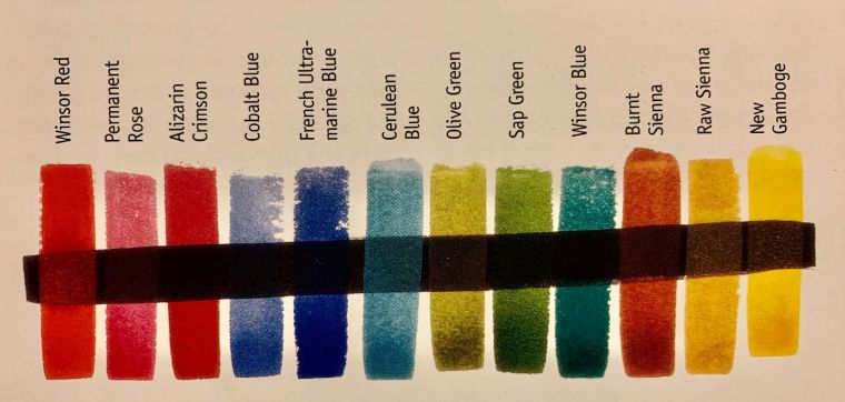
STAINING TRANSPARENT pigments, such as Indian yellow, Phthalo/Winsor Blue, Phthalo/Winsor Green, Prussian Blue/AntwerpBlue, Phthalo Violet, are bold and intense. They are NOT easily lifted. Because they are transparent, they will NOT produce mud IF mixed with other transparent colors. Mixed full strength, they create rich darks.
NON-STAINING TRANSPARENT pigments, such as Permanent Rose, Aureolin Yellow, Viridian, or Cobalt Blue, on the other hand, are delicate and can be lifted easily. They are ideal for glazing, layering, or mixing a transparent gray from primary colors.
Still other pigments, like Lemon Yellow, Gamboge, Quinacridone Rose, Cobalt Violet, Sap Green, or Ultramarine Blue, are LOW-STAINING and transparent to semi-transparent. Intensity of these colors is average, and they can be partially lifted.
If you wish to lift one color of a mixture and reveal a second color underneath (e.g. by blotting out clouds or scraping paint back to create rock texture or a tree trunk), then combine a staining pigment with a non-staining pigment.
Stormy Hills – Opaque pigments do not allow earlier color layers to show through.
OPAQUE colors tend to be less bright, although semi-opaque pigments, such as Cadmium Red, Cadmium Orange, Cadmium Yellow, or Cadmium Lemon, can be somewhat luminous when thinned or diluted. The opaque earth colors, like Indian Red, Light Red, Yellow Ochre, Burnt Umber, Sepia, Indigo, or Cerulean Blue, are often LOW-STAINING and UNSATURATED (not a vivid bright). Burnt Sienna and Raw Sienna, earth colors, are a bit unusual in that they can be transparent. Remember that adding an opaque color to a paint mixture or layering with an opaque pigment will make creating ‘muddy’ color more likely. Further, if you begin a painting with opaque color, you’ll probably lose the effect of light.
CREATE A COLOR CHART TO DETERMINE TRANSPARENCY:
Transparency and opaqueness of paint pigments can vary quite a bit by manufacturer. For example, Raw Sienna ranges from yellow to orange to brown depending on the company that formulates it. So, get to know the specific paints YOU have on your palette by creating a color chart. First, draw a line with a black permanent marker (or waterproof India ink). Allow to dry. Paint swatches of medium dark paint over the black line. Transparent colors won’t cover the black line. Opaque colors will. Staining colors will look dark.
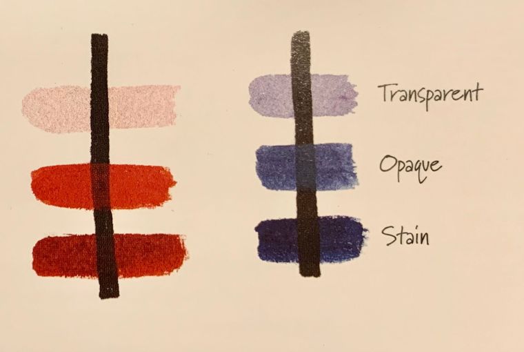
Two Color Chart examples.
IN SUMMARY:
Most organic or synthetic paints are transparent, while earth colors tend to be semi-opaque or opaque. The transparent pigments are the most versatile type of watercolor. They remain transparent when mixed with other transparent colors. Opaque colors, on the other hand, DO NOT mix well with other opaques. Try to combine opaque paints only with a transparent color or colors, if possible, to avoid mixing muddy colors. Or, best of all, use an opaque pigment by itself to show off its best attributes.
Get to know the paints on your palette. As Jean Dobie states in Making Color Sing, “To paint glowing, vibrant watercolors, you must become familiar with your pigments’ personalities.”
Join me and get painting tips, inspiration, recent art news, or information about new art or products for sale, sent to you by email. Subscribe here. I’ll give you a free copy of my Color Blending Tips pdf. that you can download and print.
