Join me and get painting tips, inspiration, and the latest news about classes, new art or products for sale, sent to you by email. Subscribe here. I’ll give you a free copy of my Color Blending Tips pdf. that you can download and print.
WOW! VS. BORING.
As an artist, you have the opportunity to improve a composition before you paint it! Don’t be tempted to merely copy what you see before you. Every detail you see does not have equal importance. Instead, change an ordinary scene into an extraordinary painting. If you just paint what you see, without thinking, evaluating, or redesigning, you may end up with a painting that has no “WOW!”
LOOK FOR SHAPES.
But how do you go about improving the subject you want to paint? How can you make your image better and design stronger? What should you do to create a painting with impact? Wouldn’t it just be a lot of work, especially if I don’t know how to improve my image? How do some artists create an exciting painting about a mundane, everyday subject? Copying is NOT enough! But, the answer may be, at least in part, to use interesting SHAPES!
While you may think that most artists begin their paintings by drawing LINES that represent objects to be painted, this is often NOT the first thing that they do to prepare for painting. Instead, an artist usually looks for or tries to compile a strong composition. One of the best ways to plan a composition is to reduce a scene to its essential or most basic components, to cut out distracting details, to simplify.
SIMPLIFY.
To help you start to simplify and reduce distractions, squint your eyes. Then look for the dominant shapes in the scene. Some artists SIMPLIFY by limiting the number of dominant shapes that they focus on to three, seven, or twelve, no more than fifteen. Evaluate and think about what shapes you could rearrange or emphasize, which shapes are important and which provide support for the other shapes. For instance, should the house in your painting be moved closer to or even overlap the barn? Should you remove that distracting tree? Are there too many cars in the image – they don’t add any helpful information?
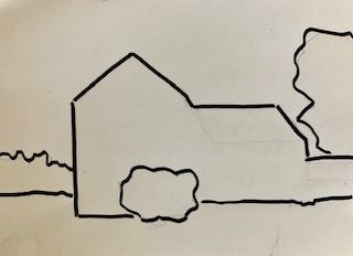

Above: Dominant shapes, & finished ‘Forsythia House’ Watercolor.
The relationships of the interlocking shapes in a picture will determine balance and interest. Good painters make more interesting shapes! This makes a more effective composition.
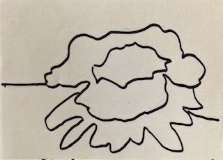
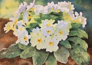
Above: Dominant shapes, & finished ‘Primrose’ Watercolor.
PAINT SHAPES NOT OBJECTS.
Try to see the world around you as made of shapes, and you will find it easier to become an arranger of shapes. Make an effort to avoid focusing on drawing or painting ‘a tree’, ‘a boat’, ‘a dog’, ‘a car’, or ‘a streetlight’. Paint what you ’see’, not what you think you see. (Check out my related blogs “Avoid Painting Lollipop Trees – Part I, II, and III”, https://leemuirhaman.com/2019/03/13/avoid-painting-lollipop-trees/, https://leemuirhaman.com/2019/03/19/avoid-painting-lollipop-trees-part-ii/, https://leemuirhaman.com/2019/03/26/avoid-painting-lollipop-trees-part-iii/, published March 13, March 19, and March 26, 2019.) Beginning painters can get so preoccupied with NAMING details (“Is this a tail?”, “Are the feet crossed?”, or “I can’t tell what this is!”) that they forget to look at shapes and their relationships to each other. You need to paint SHAPES! Practice “seeing” in shapes, like an artist.


Above: Dominant shapes, & finished ‘K’s Dog’ Watercolor.
One way to define shapes is to think about their geometric form. Are they circles, squares, rectangles, triangles? These are simple shapes, but very static and dull. They should be improved and made more dynamic by varying their size and shape contour, connecting two or more shapes together, overlapping shapes, avoiding symmetry. A building is much more interesting when viewed from an angle, as opposed to looking at it straight-on. Don’t forget that skies, shadows and reflections are also shapes. Take note: interesting and unusual shapes are better than regular or precise shapes!


Above: Dominant shapes, & finished ‘Golden River’ Watercolor.
Once you have selected your scene to paint, simplified, rearranged and refined the dominant shapes, then choose one shape to be more important than the others. This shape will be your center of interest, what you want your viewers to notice. There can only be one center of interest in a painting. Plan how you will arrange your values (lights/darks) to highlight the most important shape for more emotional impact. More impact can also be created by the skillful use of color. White paper, for instance, can be a luminous and striking unpainted shape!

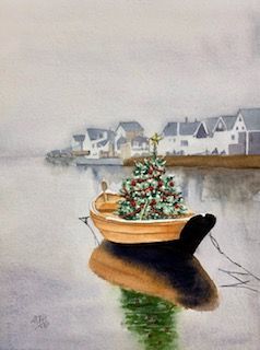
Above: Dominant shapes, & finished ‘Floating Christmas Tree’ Watercolor.
Then, finally, having completed your planning for the best composition, by simplifying shapes and perhaps sketching out a couple of different arrangements of shapes in a black & white thumbnail sketch, it is time to carefully draw your shapes (not merely the outlines of specific objects) onto watercolor paper in preparation for painting.
IN SUMMARY.
In summary, everything has a shape! We tend to want to paint shapes just as they are, without changing them or making them more interesting. This can, however, lead to busy and confusing, static, or just perhaps even dull and boring paintings. It’s important to be able to conceptualize flat shapes for your flat watercolor paper, rather than just to think about three-dimensional objects (such as “mountain” or “boat”). When you can focus on shapes, it becomes easier to adapt shapes to suit your painting, move shapes to improve your composition, and remove clutter (get rid of boring or poor shapes), and add different colors to highlight certain shapes. So, strive to create simple but exciting paintings by making dynamic shape combinations.
Join me and get painting tips, inspiration, and the latest news about classes, new art or products for sale, sent to you by email. Subscribe here. I’ll give you a free copy of my Color Blending Tips pdf. that you can download and print.

4 Comments