I’ve got a newsletter now! Subscribe here. I’ll give a free copy of my blending tip pdf.
TONAL VALUES (tones) refer to how light or dark something is. Tones have nothing to do with color, although each color does have a tonal value. For an artist, value is seemingly the most important aspect of color. Color and value usually work together to give each picture its impact.
Colors (hues) themselves each have their own tonal value. Yellow, for instance, has a relatively light tonal value, whereas red has a darker tonal value. Some blues appear almost black, having a very dark value.
The VALUE RANGE of colors refers to the number of values an artist can mix between a color’s darkest value (straight from the tube) and lightest value (When mixed with water in watercolor). Yellow, which has a light value, has a short value range. That is, not as many variations of tone are possible as with some other colors. In contrast, red has a long value range, with many variations of light and dark red possible.

Value is important in painting because changes in value are used to describe an object’s shape and form, as well as suggesting space and depth, thus creating the illusion of three dimensions on the paper. It is the contrast between light, medium and dark values which creates the illusion of light falling on an object.
Every object has a RELATIVE VALUE; its value is compared to its surroundings. In nature, as light falls on different objects it affects their relative value. A light colored object in deep shadow may appear darker (in color and value) than it actually is. On the other hand, a dark object in bright sunlight may appear lighter (in color and value) than it is in reality. In this way, tone/value describes the relative amount of light an object is receiving. A light value suggests something is lit, while a dark value shows an object in shadow.
As painters, we strive to have a convincing balance of light, dark and mid tones in a painting. But, sometimes our eyes can fool us. We’ve all been deceived by optical illusions. We know that sometimes we shouldn’t believe our eyes.
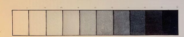
How, as artists, do we judge these light and dark values as we attempt to accurately capture details in a scene? A GRAY SCALE (or value scale) can help to measure and replicate lights and darks. The absolute value of objects needn’t always be measured and reproduced exactly, but the relative value is extremely important to approximate correctly! By comparing the values in our paintings with values on the gray scale, we can insure consistent value relationships within in our pictures.
The gray scale (or value scale) is most often comprised of five to ten sections of even, gradual gradations of gray, progressing from white (value 1) to black (value 10, in a ten section scale).

Without color, that is, using just variations of black and white, it is easier to see and focus on value.
Color often distracts the less experienced painter from the importance of value/tone. By using the gray scale, you can determine the values of colors (or colored objects). To use a gray scale, you generally look at your colors while squinting your eyes. Squinting makes the hue less dominant and value more obvious. As the hues of the color diminish, you gain the information you need about value. The highlights and darks are still visible, while ares of similar value unite and non-essential details fade. With practice, discerning the value of each color without being distracted by the color itself becomes easier.

(Above) Location of some palette colors arranged along a gray scale.
Since value is relative, rather than absolute, we try to think in terms of ‘lighter than’ and ‘darker than’. In a painting, the lightest tone may not be white and the darkest value may not be black. Therefore, use the gray scale (value scale) to determine the strength of one value in relation to another and in relation to the whole.
Another way to evaluate light and dark values is to use a black and white photocopy. Print out a copy of your reference template in black and white, and compare its values to the values in your own painting. You could also photocopy your own painting in black and white to help you judge how well it approximates the desired values. Or use a sheet of red acetate (which sometimes is included in value finder kits such as Don Rankin’s Magic Value and View Finder, available at cheapjoes.com or at Lee Muir-Haman Watercolors, 64 Meadow Road, Townsend, MA, 01432, 978-772-2001). Hold the red plastic over a scene and look through it. The red color will eliminate other colors, leaving visible a range of values.
Jan Kunz explains that the shadow side of objects is a full 40% darker than the sunlit side (Painting Watercolor Florals That Glow (1993), p. 68, Watercolor Basics (1999), p. 30, and Watercolor Techniques (1994), p. 3, and cast shadows are somewhat darker still. Even the shadow side of clouds is 40% darker than the cloud areas in sunlight.
If our gray scale (value scale) has ten sections, we count up or down four values (on a gray scale with 10 sections) to arrive at the 40% difference in desired values. When local color (the actual, true color of an object) is darker, the shadow color will also be darker, yet the 40% difference in value will still be accurate. So, to paint the illusion of sunlight, first determine the value of your subject in sunlight. Kunz suggests counting four values down to get the value of the same object in shadow. Then, simply match the value of your colors to the gray scale and you will have a reasonably accurate illusion of sunlight and shadow. Since values are relative to their surroundings, you can relate all values in your painting to each other in a similar way.
Join me and get painting tips, inspiration, the latest news about classes, new art or products for sale, sent to you in my newsletter. Subscribe here. I’ll give you a free copy of my Color Blending Tips pdf., that you can download and print.

4 Comments