Most artists know composition is critical for a painting. Every painting profits or is handicapped by the quality of its underlying design and structure. As landscape artist John F. Carlson has said, “The composition will either make or break the picture.” This is why merely copying an image in your painting, without evaluating composition, is NOT a good idea. You might have stumbled upon a good composition, or maybe not.
DEFINITION.
To many students, composition is vague, confusing, and quite uninteresting. They don’t understand it. So what exactly IS composition? Simply put, composition is the arrangement of elements and shapes in a painting. It is the design or structure that defines your painting. And just as in construction of a building, the success of a painting depends on foundation and framework: in painting, the composition. Therefore, composition is the FIRST thing to consider when conceiving of a painting.
When you go to a gallery or museum to look at art, what draws you to a painting is probably not details, highlights, fine brushwork, or even the subject, since you probably can’t see those things from across the room. Instead, what you notice and respond to first tends to be the arrangement of the big shapes, their color and contrasts, and how they fit together: the painting’s composition. As painter Ian Roberts maintains in his book Mastering Composition, “Those dynamics function whether or not you believe them, see them or want them to, and they affect the success of every painting you make” (p. 8).
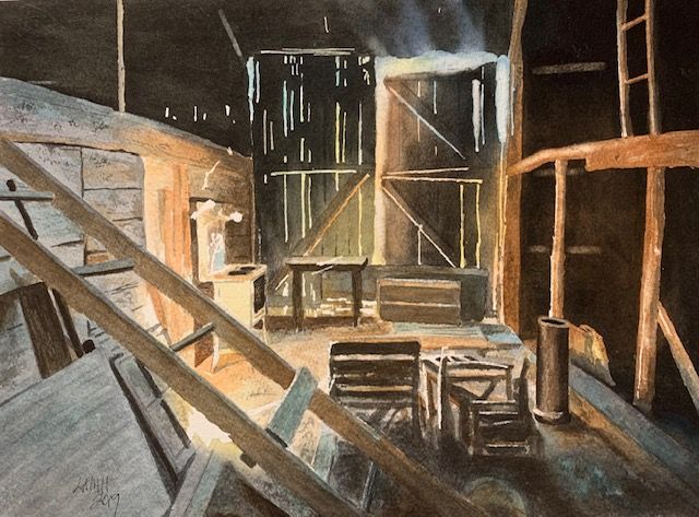
‘Tristan’s Barn’ Watercolor painting.
PURPOSE.
The purpose of composition is to create a pleasing, balanced design. You intend to capture the viewer’s attention. Your job as an artist, no matter what your painting style, is to get the viewer to see what you want them to see in a work of art, through the use of various design elements. Achieving this end involves establishing a focal point and center of interest while avoiding unnecessary and distracting details.
You hope to attract and lead the viewer into your painting and then have the viewer keep looking around. Once a viewer shows interest in your painting, you want to have provided (with your composition) a path for the viewer’s eye to follow as the viewer continues to explore your painting (FLOW).
Using SHAPES, VALUES, EDGES, and COLOR, an artist can arrange elements to produce an interesting and unified image. Seldom is a real life scene so perfect that it cannot be made more interesting by moving things around, changing sizes, tones, colors, and so on.
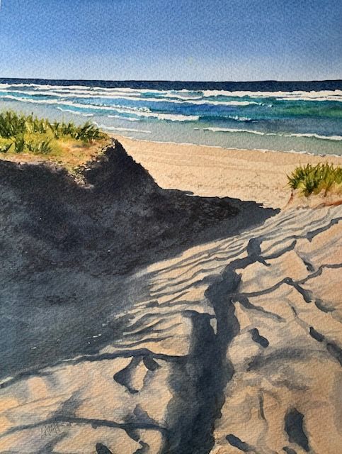
‘Beach Shadows’ Watercolor painting.
A PERCEPTUAL SHIFT.
While you may choose an image to paint because you like the SUBJECT, subjects do NOT make a composition. Artist Georgia O’Keeffe has said, “A hill or tree cannot make a good painting just because it is a hill or a tree.”
Once you have chosen your painting topic, don’t forget to then think about the picture’s foundation (structure, arrangement of shapes) before beginning to paint. Focusing on your subject and details too early leaves out an important step in the process of creating a painting. Don’t neglect to establish first a working arrangement and flow of shapes (composition). Yes, you may have to eliminate some distracting or unnecessary information, even rearrange shapes to make your picture work.
Mastering composition requires a PERCEPTUAL SHIFT in thinking about how a painting is constructed. Remember that SEEING like an artist involves seeing images and shapes, not focusing on things. French poet Paul Valery described this shift when he said, “To see is to forget the name of the thing one sees.”

‘Snowy Winter Barn’ Watercolor painting.
STEPS IN CREATING A PAINTING.
The first step or FOUNDATION of a painting is deciding on the edges and proportion of your picture. Will your art be square, vertical, or horizontal? What size will it be? These initial decisions will affect every subsequent decision.
After establishing the foundation, you can begin to consider an appropriate ARRANGEMENT of major light and dark SHAPES (composition), an arrangement designed to channel the viewer’s eye movement through your picture (FLOW). You DON’T just want a lot of little shapes, since such profusion encourages over-emphasis on details. You are hoping to “translate” your picture into a few strong and simple, but related, shapes.These related shapes are the key to the success of your work. Better paintings are not wholly dependent on developing improved painting skills and better techniques. Better paintings need effective composition.
One way to begin to improve the composition of a reference is to use a VIEWFINDER. A viewfinder helps you isolate a good arrangement and CROP an image. Move the viewfinder closer to your eye and farther away, back and forth, left to right, up and down, searching for the best composition. You can also easily CROP and save a photo on your smartphone to improve an image, reduce clutter, or emphasize a focal point.
The sky could be a major shape in a landscape. Another value mass could be a group of trees including their shadow. A third shape might be the sunlit field, which will lead the viewer into the picture. And yet another shape might be some distant hills. In this way, your scene could be built on those four major shapes, some of which you will paint with light values, others with middle values, and still others with dark values.
Only when you have established an effective arrangement of shapes are you free to begin painting and free to think about and refine the next component, the SUBJECT. Then come DETAILS and highlights, the last consideration, where you will make the desired finishing touches in a painting.
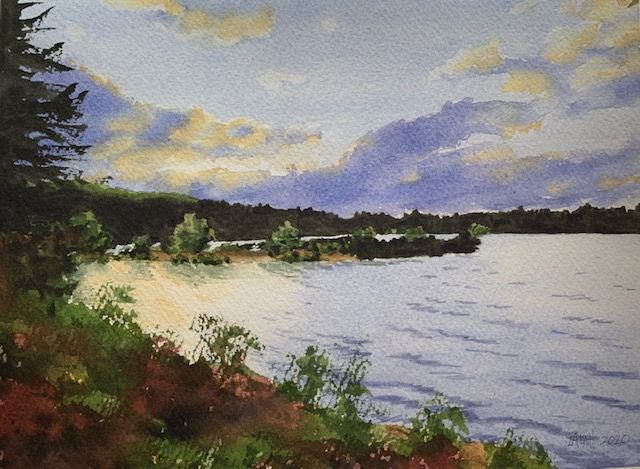
‘Wachusett Reservoir Sunset’ Watercolor painting.
RECOMMENDATIONS THAT CAN HELP YOUR COMPOSITION WORK.
Ian Roberts in his book Mastering Composition, has shared these suggestions for ensuring good composition:
1.) Crop an image to make it dramatic and interesting, as opposed to creating a static, polite and dull arrangement.
2. ) Look for value masses (shapes), as opposed to lots of tiny details.
3. ) Design any division with rhythm. In other words, avoid spacing objects in your painting evenly distant from each other and all the same size. Strive for a variety of shapes and sizes, spaced unevenly.
4. ) Keep shapes varied, unique, and interesting. For instance, every tree has its own unique shape.
5. ) Avoid placing objects right on the edge of your painting, as doing so draws and holds the viewer’s eye. It thus distracts the viewer from your center of interest.
6.) Use overlapping objects to help create depth, by showing one object situated in front of another.
7. ) If you have a lot of interest in the corners of your painting, try to adjust edges and reduce any contrast there in an effort to pull the viewer’s eye back toward the center of the picture.
8. ) Create a path or entrance for the viewer’s eye along the bottom edge of your painting. Avoid blocking the way for the eye to move into your picture with bushes, a hedge, a fence, or the edge of a table.
9. ) Organize your major shapes. If your image has no emphasis, drama, or direction, you can rearrange. Bushes and trees, clouds, water reflections, or lights and darks can all be adjusted until the arrangement of shapes encourages the viewer to move through the picture and look at your center of interest.
10. ) Use gradation (from light to dark, or dark to light) to move the viewer’s eye and create balance. The eye will naturally be pulled from dark to light and, ideally, encouraged to move toward your center of interest.
11. ) Use straight lines to avoid suggesting a detached, floating feeling where you don’t intend one.
12. ) Depth is easier to achieve when you think in terms of a foreground, middle ground, and background. Adjust the amount of detail in each. Often the middle ground contains the most detail, if this is where your center of interest is placed. The foreground draws the viewer into the middle ground, while the background creates a more distant space for the middle ground to meet up against. To avoid flattening the image, do not put the same amount of detail in each of these areas.
SUMMARY.
This article is just an introduction to composition; the subject is vast. Feel free to study and learn as much as you can about the tools used to create good composition. Composition may not seem as exciting or fun as color mixing, for instance, but learning about it is essential for good painting. Your composition, or design, is what captures the viewer’s attention and what can make or break your picture.
Excellent resources about composition include: Ian Robert’s book Mastering Composition (2012) and Edgar Payne’s classic Composition Of Outdoor Painting (1941, Latest Edition 2019).
I have found the following books useful, as well:
Watercolor Composition Made Easy by David R. Becker (North Light Books, 1999), and Design And Composition Secrets Of Professional Artists (Editors of International Artist magazine, 2001).
You might also be interested in these related blog posts:
- Designing a Strong Painting with Good Composition!, (10/16/2018), https://leemuirhaman.com/2018/10/16/designing-a-strong-painting/ ,
- Formats for Effective Compositions (Volume I)…, (10/30/2018), https://leemuirhaman.com/2018/10/30/formats-for-effective-compositions/ , and
- Formats for Effective Compositions (Volume II)…, (11/6/2018), https://leemuirhaman.com/2018/11/06/formats-for-effective-compositions-volume-ii/ .
Join me and get painting tips, inspiration, recent art news, or information about new art or products for sale, sent to you by email. Subscribe here. I’ll give you a free copy of my Color Blending Tips pdf. that you can download and print.

Great article. Thank you.
LikeLike
Thank you, Bernard! I’m glad it was helpful to you.
LikeLike
Thanks for this summary. I have Ian’s book on my shelf and really want to commit to his thirty days of doing value sketches but my life goes crazy busy and I need my art time for therapy that involves painting with color. Perhaps june through September will be slow enough for me to commit…..
LikeLiked by 1 person
There’s no way we can do everything that we’d like to. In fact, I don’t think anyone needs to feel they
ought to be doing it all. And, thank goodness, we each get to decide what is important to us. I hope you continue to enjoy your color!!!
LikeLiked by 1 person
Thanks Lee, I think the internet is making it worse. Too many art inputs and ideas to scroll past.
LikeLiked by 1 person