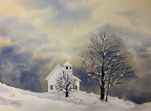
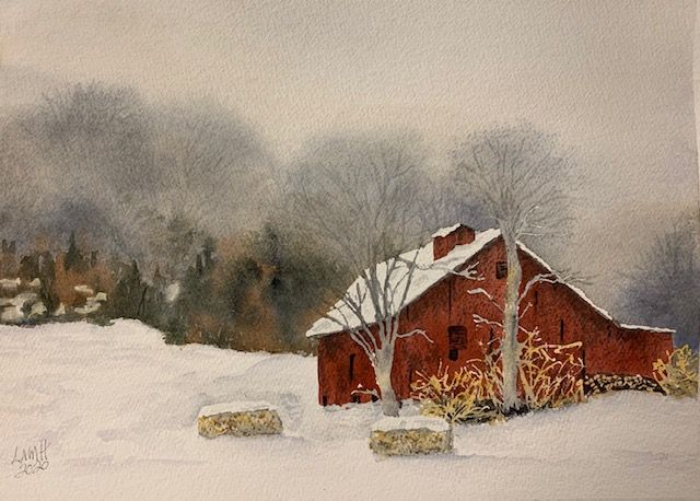
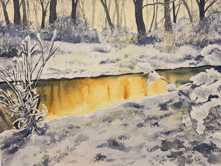
A good painting is a successful illusion in two dimensions that creates the impression of a reality in three dimensions. Artists can use SHAPES, VALUES, EDGES, and COLOR changes to arrange elements within a picture to produce an interesting and unified image. Seldom is a real life scene so perfect that it cannot be made more interesting by moving things around, changing sizes, tones, colors, and so on. As artists we strive to get our viewers to see what we want them to see. This involves establishing a focal point and center of interest. Artists strive to inject energy into their painting, while avoiding unnecessary and distracting details.
The job of the artist is to incorporate design elements for maximum visual effect into a pleasing and balanced design. Whatever your style as an artist, the arrangement of elements in your picture (COMPOSITION) should always appear to have purpose and be under control. Your composition, or design, is what captures the viewers’ attention.
DESIGN ELEMENTS.
What are these DESIGN ELEMENTS that work together to make a strong picture? How are you supposed to put them together? There is no one way to compose a painting, yet some rules and guidelines can help you think about what makes a good composition. In time and with practice, you may become less reliant on these guidelines and learn to rely more on yourself and your own intuitive preferences.
For now, be aware that you have only so many tools to work with. These ‘tools’ are the ‘elements’ of design. They are VALUE, SHAPE, LINE, COLOR, and FORM. With these tools, painters can create certain effects; these effects are referred to as the ‘principles’ of design. More specifically, these principles include UNITY, BALANCE, VARIETY, RHYTHM, CONTRAST, MOOD, MOVEMENT, and PERSPECTIVE. These terms may seem confusing at this point, but think of the matter this way: You can use COLORS to create MOOD, as well as aerial PERSPECTIVE, and VARIETY. Or you can use LINE to create a sense of linear PERSPECTIVE, MOVEMENT, or RHYTHM.
UNITY is the sense of wholeness or completeness in your picture and is one of the most important design principles. You can create UNITY by letting some element be dominant — that is, by emphasizing it in the picture (DOMINANCE). Dominance needs to be tempered, however, in order to create BALANCE and VARIETY. Some of the opposite element needs to be included so the dominant element is not overwhelming. You may wish to compose a warm picture, so your palette of colors might contain a variety of warm pigments. If they are all warm, however, they lose their effectiveness. Smaller amounts of cooler, complementary colors should be scattered about the painting to mix with the warm colors and help balance the effect.
You can create RHYTHM by repeating a certain distinctive element in a painting, such as SHAPES, LINE, COLOR, or SPACES. For instance, specific shapes not only reveal the basic qualities of the subject matter but can be repeated to increase UNITY in a picture. Repeated tree trunks or an arrangement of rocks on a shoreline would be examples of SHAPES and LINE used to create RHYTHM.
CHOOSE ONE OR TWO DESIGN ELEMENTS.
The true purpose of unity and dominance is to make your painting more appealing by giving it an emotional punch and an intriguing ‘personality.’ Dominance and unity are easier to achieve if you choose only one or two of the elements to emphasize in a picture. You might choose one VALUE (light or dark) and one type of LINE (perhaps curved), while the remaining elements, COLOR or SHAPE, for instance, play supporting roles.
It is natural for people to react to certain visual stimuli, and an artist ought to know and use these stimuli to create more effective compositions. For instance, our eye automatically goes to anything out of place or different from its surroundings (CONTRAST). An artist can employ contrast of VALUES (light vs. dark, dark vs. medium, and so on) to improve a painting. We are naturally attracted to the lightest objects or areas that we can see. To surround a light area in a picture with dark values increases contrast and draws attention to that light area. We tend to skip over lesser degrees of contrast, although these play an important role in setting a mood in a composition — for example, dark corners in a sunlit room.

CONTRAST in COLOR can be useful as well. Colors can contrast in HUE (the basic color, such as red or blue), VALUE (light or dark), INTENSITY (pure or dull), and TEMPERATURE (warm or cool). An artist will often employ color contrast using more than one of these kinds of contrast at a time, perhaps using pale, dulled blue (HUE, INTENSITY, TEMPERATURE) as well as darker, pure orange (HUE, VALUE, INTENSITY, TEMPERATURE) in a painting, for example.
CONTRAST in SHAPE and LINE (or edges) is a good way to get things of interest to stand out from their surroundings. We notice hard edges and shapes that are different from each other, whereas soft edges blend and can subtly avoid attention, as in camouflage.

How we see our physical surroundings affects our emotions. Think about how you feel as the sun breaks out after days of dreary, overcast skies. In a painting, though, the emotional environment involves more than just the weather or the sky. The MOOD (or atmosphere) is the whole pervasive setting for your painting subject. A specific atmosphere or mood (for instance, the gloom inspired by the shadowy edge of a dark forest) adds drama and appeal to your composition. (See another of my blogs entitled “Get In The Mood” dated September 4, 2018 for a more detailed discussion of mood and atmosphere.)

MOVEMENT is a way to add energy and excitement to your composition. Movement attracts our attention. You can create it in several ways – by IMPLYING movement, by POINTING the viewer’s eye to a specific target with shapes, or by providing a PATH for the viewer’s eye to follow.
Since anything that parallels the frame of your picture tends to be viewed as stable and balanced, an artist might try to place shapes and lines at an angle to the frame. Curving lines IMPLY more MOVEMENT, energy, and character than do straight lines. Further, if a painting is too SYMMETRICAL, it will seem stiff and unexciting. A bit of ASYMMETRY (imbalance), by contrast, creates tension to move the viewer through the painting.
Many of the objects you put into a painting can have a POINTING quality that leads the viewers’ eye in a certain direction. This pointing can be useful in getting the viewers to see what you want them to see. By simply arranging objects in a painting in a certain way, you can suggest action and movement.
You gain control of what viewers look at when you can direct their eyes to follow a PATH in your picture. Try to arrange and position shapes to lead a viewer to look toward points of interest. Visual pathways create MOVEMENT and will lead the viewer in the direction you choose. Artists commonly use a road, path, or river as an invitation to viewers to move into a painting.

A PATH can also be a FORMAT (structure) for a painting. Different types of structures exist, including CLOSED (any path that comes back on itself and thus contains or surrounds the subject matter) and OPEN (a path that causes the eye to move back and forth, such as a zigzag or a spiral).
PERSPECTIVE is what gives the illusion of depth to your composition and makes it appear three dimensional. LINEAR PERSPECTIVE works by making objects seem further away because they appear smaller. As objects move back in the distance, they grow proportionally smaller and closer together. For example, in a sky with rows of clouds, the cloud formations become smaller and closer together (and may even appear to overlap) as they proceed toward the horizon. A series of overlapping shapes can increase the illusion of depth. Darkening a foreground or showing only a part of an object in the foreground can give the viewer a feeling of peering deep into a landscape. AERIAL or ATMOSPHERIC PERSPECTIVE creates a feeling of distance by observing the effect the atmosphere has on the landscape. Objects in the distance seem mistier, paler, and less distinct than in the foreground. Colors become lighter, cooler, and grayer when further away, while details are progressively reduced into the distance.
Skillful use of the principles of design improves any composition. A good composition depends on the artist’s knowledge of these rules, yet also is dependent on the use of intuition (or instinct). The intuitive aspect of composition is what makes each piece of art unique. Using your instincts adds flavor and creativity to your art. Move different parts of your painting around to emphasize or strengthen your composition until the painting feels right to you. The rules of composition are there to solve design problems, but rules can eliminate creativity if followed slavishly. Try to think of design elements as a foundation to base your composition on. Then trust your intuition!
Join me and get painting tips, inspiration, the latest news about classes, new art or products for sale, sent to you in my newsletter. Subscribe here. I’ll give you a free copy of my Color Blending Tips pdf., that you can download and print.
3 Comments