For many years, I used the colors and brands of watercolor paint that my instructors used. (Interestingly, each instructor had different preferences.) There were so many different colors to choose from I was unsure why they used some colors and not others. I didn’t worry too much about their color choices when I was just starting to paint, being more focused on learning technique, but as I gained experience, I wanted to understand why we used those particular colors. Was it just a matter of personal preference, habit, or were certain colors better for some reason? Why?
LEARNING ABOUT COLOR CHOICES.
Over time, ‘color’ became more and more interesting to me. There were certainly many different ways to mix colors from the paint that was on my palette! There was such variety! Yet at some point, I began to feel some dissatisfaction with certain black, gray, and green paints straight from the tube, and began to prefer my own mixtures. Even some of my own mixes, however, didn’t turn out well or the way I expected. I wanted to learn even more about color mixing. Unlike blends that I created from mixtures of (primarily) primary colors, some of the tube paints seemed dull, flat, uninteresting, and lifeless. Other tube paints looked stark, strident, unnatural, and out of place in certain pictures. Curious! I began to notice details that I had not been aware of before. And I was starting to think about and change my opinion of a few of the colors on my palette.
QUESTIONS.
Why did some paints, like some of the reds, greens, and browns, look so flat and dull? Everyone talks about ‘Transparent Watercolor,’ but what is it exactly? Are all watercolors transparent? And why is transparency important? How are opaque colors different from transparent colors? For more information about transparent watercolors, see “Why Does It Matter If My Paint Is Transparent Or Opaque… As Long As I Like The Color?”, (11/26/2019), https://leemuirhaman.com/2019/11/26/why-does-it-matter-if-my-paint-is-transparent-or-opaque-as-long-as-i-like-the-color/ .
I wondered where the elusive ‘glow’ or luminescence of watercolor comes from. Is it ‘in’ certain pigments, or does it result from how the paint is applied? I decided to find out how to make my paintings glow.
As I studied and experimented, I learned more about the characteristics of pigments and how they behave. The issues were confusing. Some paints worked well in certain situations but not in others. Some colors mixed cleanly with others, but similar-appearing colors, when mixed with another color, turned into mud. Ugh! I realized that all watercolor pigments are NOT transparent or equal in intensity. All blues are not interchangeable. In fact, sometimes tubes of paint with the SAME NAME do not even contain the same pigments. How could one expect them to behave the same? And, further, some tube paints are not made from a single pigment but are various mixtures of a number of pigments, each of which has its own different characteristics.

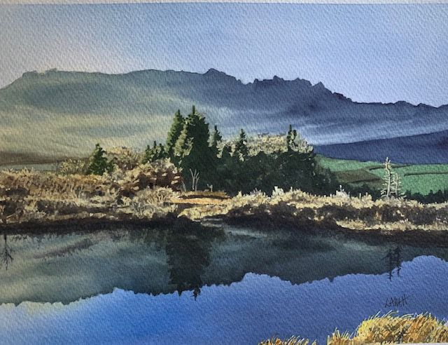
‘Beach Shadows’ Glow in Watercolor Painting.
GLOW VS. MUD.
Jeanne Dobie, in Making Color Sing, describes how she makes vibrant, glowing color, both light and dark. To give you more control over your color mixtures, she recommends transparent and pure color pigments as a base for your palette colors. To capture the ‘effect of light’ in watercolor, use transparent and single ingredient pigments. Dobie says, “Because transparent colors permit the greatest amount of light to pass through to the paper, reflecting back to the viewer, they impart luminosity. Moreover, they remain transparent when mixed together – so there’s no mud!… If you begin a watercolor with opaque pigments, you’ll lose the effect of light. Opaque pigments are denser and heavier, which greatly reduces the amount of light transmitted through to the paper. Because of this ‘thickness,’ an opaque pigment does not mix well with another opaque color. It only becomes thicker! If you mix two opaque pigments together, you are flirting with a muddy mixture. Should you mix three opaque pigments together, the result may be too lifeless to call a watercolor.”
WATERCOLOR INGREDIENTS?
Watercolor pigments are composed of several different types of materials. First, some pigments are made of ground MINERALS or EARTH. These have a tendency to float on the surface of the paper, whether transparent or not, and so may NOT be very good for mixing. (On the other hand, I think it is interesting that some mineral pigments are quite transparent or semitransparent — for example, genuine ultramarine blue, burnt sienna, raw sienna, cobalt blue, viridian, and manganese blue.) Second, some pigments are ORGANIC DYES. Third, other pigments are SYNTHETIC DYES. The dye pigments are NOT all transparent as one might expect, because some are combined with various fillers by manufacturers.

‘Red Bumpers’ Glow in Watercolor Painting.
COLOR PREFERENCES CHANGE.
Gradually, I have added more transparent primary colors (red, yellow, blue) to my palette and reduced the number of opaque pigments. I have tried to find transparent colors made from a single pigment (i.e. ‘pure’, as Jeanne Dobie describes). I now have a wide variety of transparent (or semi-transparent) red, yellow, and blue primaries which can be mixed into numerous clear variations. I chose each paint for a particular quality; while some are very similar, no two pigments are exactly alike. In other words, they make look alike in appearance, but behave very differently.
On my palette, I continue to keep some additional “occasional use” colors that are opaque (or semi-opaque), such as cerulean blue, cobalt teal blue, perylene green, raw umber, and burnt umber. I did remove Indian red, perylene maroon, Naples yellow, chromium oxide green, Payne’s Gray, and cadmium orange (all opaque colors) from daily use. Many greens I mix from primary colors, but I have a few transparent greens on my palette. I do keep Da Vinci Sap Green on my palette (a mixture of two transparent pigments), as a convenience. I removed any ochres and use burnt umber with care, as they are opaque. I like the siennas because they are transparent or semi-transparent, depending on how diluted the mixed wash is. While the above earth colors may look beautiful when wet, they do seem to lose their richness as they dry, appearing flat and somewhat dull. (I plan to discuss the specific colors that I currently have on my palette in a later blog. Stay tuned!)
‘Eerie Light’ Glow in Watercolor Painting.
CAPTURE THE EFFECT OF LIGHT.
Jeanne Dobie also maintains that selecting pure transparent pigments is just the start. An artist needs to learn about color relationships (e.g. complements, warm vs. cool) and COLOR BIAS to use the colors successfully. And there can still be a place for some of the opaque colors on your palette, and the mixing of duller mixtures of complementary colors is sometimes desirable. “To complement the pretty (transparent) colors” and to enhance their jewel-like tones, she says you need to set them off with more subtle, “non-brilliant mixtures.” Thus, my first discovery in the search for “GLOW” was that the glow begins with the use of diluted, transparent colors and is often enhanced by placing duller, grayed color nearby.
A second procedure that can help to create glow in a painting is related to a technique called GLAZING. Most watercolor painters are aware that it is possible to paint one wash over another, a process called glazing. (The secret is to apply each wash, usually the lightest color first, to a THOROUGHLY DRY sheet of paper.) Now why would a painter want to do this? It seems time-consuming and like a lot of trouble. Is it worth worthwhile?
Actually yes; properly applied, layers of washes can actually produce the characteristic GLOW of watercolor and a stained-glass effect that cannot be achieved by any other means. To achieve the much-sought-after GLOW FROM WITHIN in watercolor, an artist can glaze layers of mostly transparent pigments. Pigments applied in glazes have MORE luminosity than the same colors mixed on the palette prior to application as a single wash!
Once you have practiced your wash techniques and feel you are a bit proficient at them, here is the procedure for glazing (thanks to Don Rankin, who, in his book Mastering Glazing Techniques In Watercolor, gives these clear and simple ground rules for glazing):
1. Develop your glazes from transparent watercolors (eg. Indian yellow or Winsor yellow, Winsor blue or Phthalo blue, Quinacridone red or Permanent alizarin). 2. Begin with your lightest pigment, usually a yellow. 3. Keep your washes DILUTED and transparent. 4. Make sure, VERY SURE, that all previous washes are COMPLETELY dry before a new wash or glaze is applied. 5. Use the most opaque paints toward the final stages of your painting. Using them in the initial stages runs the risk of creating mud or chalky washes.
FINALLY.
Get to know the characteristics of your paints to understand what to expect from them. Each pigment has its own qualities and personality. Feel free to experiment and change some of your paint choices, especially if you have some paints that combine several pigments, since this combination will greatly compound the difficulty of predicting how they will mix with other pigments.
The tube of paint itself can provide much information: for instance, the actual pigment ingredients, opacity, and lightfastness. Further, each paint manufacturer produces a Color Chart (see below) with even more information, including not only the above, but also whether the paint is staining or granulating. Practice color mixing with what you have on your palette, until you can reliably predict how your paint will behave. Only at that point will you be able to count on the colors to perform the way you want and expect. Your paints can be your allies or your foes, depending on how well you understand their nature. Don’t rely on happenstance.
Join me and get painting tips, inspiration, recent art news, or information about new art or products for sale, sent to you by email. Subscribe here. I’ll give you a free copy of my Color Blending Tips pdf. that you can download and print.


Thank you so much for this ground breaking way of painting. I wish I had known this before I invested in 50 Daniel Smith colors. You have changed the way I paint going forward and the way I will set up my main pallett. I’m new to watercolor and I can’t tell you how much I appreciate your expertise. Thanks again for this valuable information. Jo
LikeLike
Jo,
That’s a lot of different colors to try to get to know (and to pay for)! It could be fun though.
Try to introduce yourself to them slowly, play around and experiment, before (and if) you add some to your main palette.
My main palette is my workhorse – it has my basic, pure colors on it – and I use those colors for all my pictures. I do, however, have some small covered palettes for ‘occasional use’ or ‘fun’ colors to make use of as the mood strikes. The ones I really like are offered by cheapjoes.com (https://www.cheapjoes.com/extra-color-palette-for-cheap-joe-s-piggyback-palette.html) and are called
Extra Color Palettes. Using these small palettes, I have fun colors at the ready, to use one or two at a time, but not distracting me from the main palette colors that I know well and depend on.
Thank you for taking the time to write such an appreciative comment.
Don’t feel like your 50 Daniel Smith colors are a waste – they will be great fun to get to know over time.
Lee
LikeLike
I’m sorry I couldn’t figure out how to reply to your comment. Thank you so much for your sage advice. I did what you advised and made a “main” pallet with 21 colors. I know that’s probably a lot but I haven’t really learned the art of mixing. Just add a little blue or yellow to my green to make it a little different etc. Therefore I have pinks orange’s purples and lots of green in my main pallet. But as you said it taught me the different colors. I have played with swapping out colors as well and now have a somewhat curated pallet that I love. In the mean time I’ve tried Schmidcke, MaimerBlu, Windsor & Newton, Sennelia (sp?) and a couple more but Daniel Smith is my overall favorite. whew! Thank again for you kind and thoughtful response. Jo
LikeLike