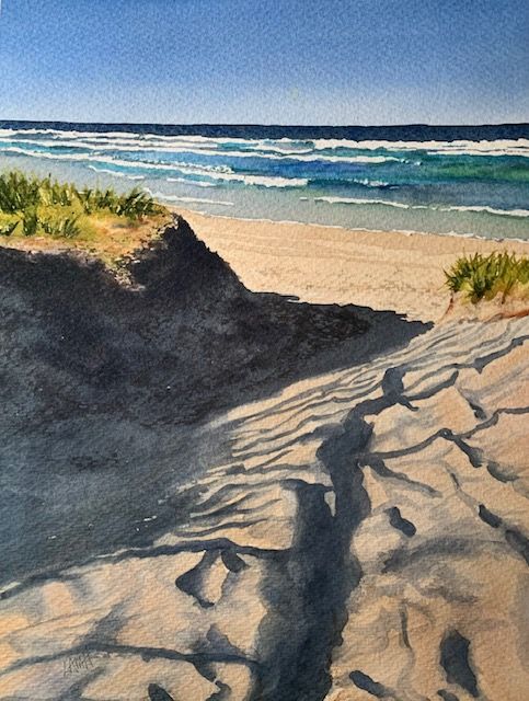
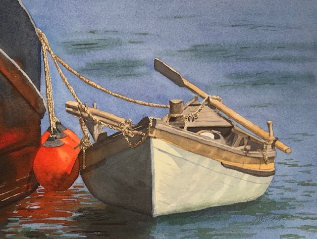
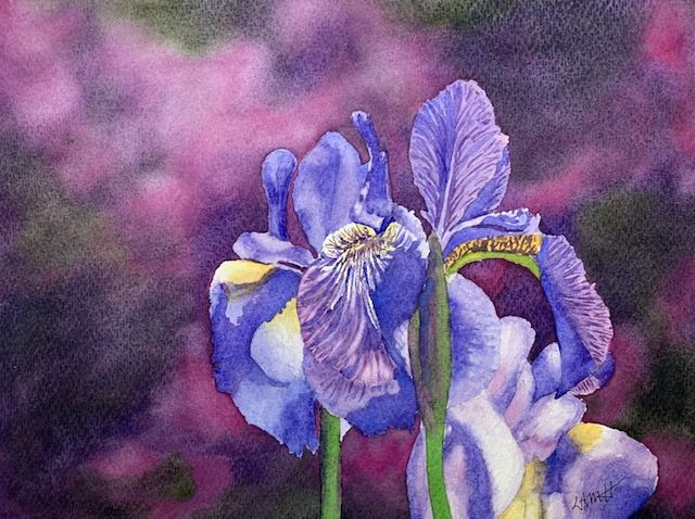
Don’t settle for less vibrant color in your watercolor painting. I see too many watercolor painters whose paintings could be improved by using stronger mixes of paint in their art. A watercolor painting needs contrast, strong lights and darks, to create impact (unless, of course, you’re painting fog, mist, or similar types of weather).

Watercolor paints change their color appearance as they dry. Colors that look to be the right value and color when painted and wet, may shift as they dry, creating a ‘DRYING SHIFT.’ Expect almost all watercolor paints to appear paler, duller, and less bright when they dry.
DRYING SHIFTS VARY BY PIGMENT.
However, when drying, some pigments change appearance very little whereas others change a great deal. Not only does a watercolor pigment end up looking different from what you expected when you mixed the paint, but EACH PIGMENT changes to a varying degree compared to other pigments.
WHY DO WATERCOLORS LIGHTEN AS THEY DRY?
Oil and acrylic paints look much the same whether wet or dry, and stay on top of the painting surface as they dry, bonding with the paint binder and forming a paint layer. In watercolor painting, however, the combination of paint, water, and binder (whether gum arabic, glycerin, honey or a glucose humectant) behave differently (from oil or acrylic paint) as the water dries.
According to Bruce MacEvoy of handprint.com, when watercolors dry, all of the water evaporates, and the paint vehicle (BINDER) “along with the dissolved surface SIZING of the paper,” are drawn by “capillary action” into the tiny spaces between the paper fibers, where they harden and dry. Paint particles may be a VARIETY OF SIZES and DO NOT uniformly stay on the surface of the paper. Instead, MacEvoy says, “in many watercolor paints, smaller pigment particles tend to be less saturated and lighter valued than the larger particles. These duller, paler and smaller particles also remain in liquid suspension longer than the more intense, darker and heavier particles, which sink first to the paper surface and into the paper crevices” where they are more hidden from light. No solid paint layer seems to be formed. Pigment particles are “strewn on top of, between, and underneath paper fibers,” revealing more of the white paper. Thus, watercolor paints will appear to whiten or fade as they dry. (http://www.handprint.com/HP/WCL/tech16.html , and http://www.handprint.com/HP/WCL/cds.html .)
CHANGES IN PAPER.
The PAPER SURFACE also changes during this process. (Different brands of paper, weight, fiber content — e.g., cellulose vs. cotton fibers — and paper finish — e.g., hot press, cold press, rough — will each be affected somewhat differently.) But, in all cases, the wet paper fibers soften and expand, becoming thicker and fuzzier, especially with repeated brushing of the paper or ‘fussing’ and fiddling with the applied paint. In general, the less agitation of paint on the paper, the better. Lots of brushing forces a larger number of pigment particles into the scuffed paper crevices which will DULL the color. If you want to achieve bright, clean color in your painting, try to apply your paint in one brushstroke (or in as few as possible) and let it dry. Limit your brush strokes!
COMPENSATE FOR DRYING SHIFT.
Drying shift is one reason color mixing can be very challenging in watercolor painting. As a watercolor artist, you should be aware of drying shift and know that you must compensate for it by adjusting your paint/water ratio. More specifically, get to know which paints on your palette tend to have a great drying shift and dry lighter or duller. (See http://www.handprint.com/HP/WCL/cds.html for Bruce MacEvoy’s chart of Watercolor Paint Drying Shifts where he lists the pigments he has found to have the greatest shifts. For example, Prussian Blue, Indanthrone Blue, Lamp and Ivory Blacks show some of the largest drying shifts, whereas Cerulean, Hansa Yellow Light, Cadmium Lemon, and Benzamida Yellow have low drying shifts. Keep in mind that drying shifts may vary by brand as well as pigment, since different manufacturing and milling methods will affect the size of paint particles.)
With some notion of which of your watercolor paints produce greater drying shifts than others, you can compensate for this tendency by mixing those pigments with LESS WATER (decreasing dilution) to create a more vibrant color mix. It is always a good idea initially to test your mixed color on a watercolor paper test sheet prior to painting, let it dry, and check its appearance when dry. With experience, you will become able to judge what the pigment will look like in a painting when dry.
IN SUMMARY.
Color drying shifts in watercolor pigments are highly variable. These shifts depend on several factors:
- the pigment itself (different pigments behave differently),
- brand/manufacturer of paint (various milling methods),
- paint vehicle (type of binder),
- paint dilution (some paints can be made more vibrant by mixing with less water),
- type of paper (brand, paper weight, fiber content, and finish),
- and application method (try to limit repeated brushing).
Compensate for large drying shifts by adjusting water/paint ratios when mixing your paint. Use more pigment (or less water) in your color mixing to intensify a color likely to produce a large drying shift. Feel free to check your mix on a watercolor test sheet to ensure your dried color will be the correct value or the value that you intend.
So, once again, don’t settle for less vibrant color in your watercolor painting!
Join me and get painting tips, inspiration, and the latest news about classes, new art or products for sale, sent to you by email. Subscribe here. I’ll give you a free copy of my Color Blending Tips pdf. that you can download and print.

Very interesting ; thank you. I’ll Try to keep it in mind when painting next time.
LikeLike
You’re welcome – hope it’s helpful.
Thanks for your comment.
LikeLiked by 1 person