TRANSPARENCY OCCURS BETWEEN PAINT PARTICLES.
Many people say that the way to create a “glow” in watercolor is to paint pale glazes of “luminous,” transparent hues so that the white of the paper underneath passes through the paint particles “like light through a stained glass window.” Apparently, however, light passing THROUGH a layer of watercolors is not the way luminosity actually works! That description is just a myth!
According to several color scientists, chemists, and Bruce MacEvoy (handprint.com), little light actually passes THROUGH the particles. Instead, transparency happens when light reflects off the paper BETWEEN the particles of watercolor paint.
We know that watercolors don’t form a solid paint layer the way acrylic and oil paints do, as discussed in this post: ‘Some Watercolor Pigments Lighten More Than Others When They Dry…,’ (9/7/2022), https://leemuirhaman.com/2022/09/07/some-watercolor-pigments-lighten-more-than-others-when-they-dry/ . Oil and acrylic paints stay on top of the painting surface and dry in a solid paint layer.
In contrast, watercolors (made up of various sizes of suspended paint particles ) end up “on top of, between, and underneath paper fibers” (Bruce MacEvoy of handprint.com). More of the white paper is therefore revealed as the water evaporates. The most transparent of watercolor paints produce a thinner coating of smaller pigment particles on the paper. These pigments in a smaller particle size seem to hide less of the paper (or other pigment particles) underneath, making the color appear more transparent. Thus, transparency happens BETWEEN these pigment particles and NOT THROUGH them ( see http://www.handprint.com/HP/WCL/tech16.html) .
ACHIEVING THE GLOW OF LIGHT.
Although transparency and glow may not work the way we once thought, achieving a glow remains a goal for many artists. We want to paint the light! We wish to highlight brightness, glow, radiance, luminosity. But to create a luminous glow, don’t rely on using lots of ‘bright’ colors that may not work together. Bright colors can be intense but also may be dull and opaque, and they may not set each other off to advantage. For example, yellow is a bright color, but if applied too thickly, even a transparent yellow becomes LESS luminous and will no longer be a light value.
Instead, although transparency is essential, luminosity comes from choosing colors by their effect on each other; that is, you should choose colors that create a reaction with nearby colors. Remember that paint colors change their apparent brightness, transparency, and hue depending on the context in which they appear.
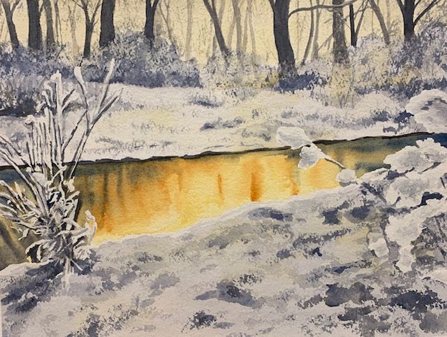
To bring about a glow, you will want to create CONTRAST in both VALUE and TEMPERATURE by surrounding a transparent light color with a COMPLEMENTARY dark ( a dark leaning toward the complement of the light color, NOT an unexciting, flat tube black such as Ivory Black, or purchased mixes such as Payne’s Gray or Neutral Tint). Colorful darks can therefore enhance the effect of light in a painting. The function of a dark color is NOT JUST to create value contrast, but to help the light-valued color (whether warm or cool, muted or intense) to glow. (For more information on complementary colors, review ‘The Color Wheel, Color Bias, And Color Mixing In Watercolor’, (7/2/2019), https://leemuirhaman.com/2019/07/02/the-color-wheel-color-bias-and-color-mixing-in-watercolor/ .)
HOW? VALUE CONTRASTS AND COLOR COMPLEMENTS.
What painting methods actually work to create glowing color? First, choose a pure, transparent color, well diluted to a light value. Second, mix your dark surrounding values to be complementary dark colors. If your light value is a pale yellow, you might try to use a version of deep purple or dark purple-gray.

ADD COLOR AND TEMPERATURE COMPLEMENTS.
To further exaggerate the glow that is forming, you can adjust your dark by taking into account color temperature. That is, establish a warm-cool relationship between your light and dark by remixing your complementary dark, altering proportions of pigments to move the color to be cooler or warmer. If your light valued yellow is WARM, the best complementary dark to set it off would be a COOL bluish-purple dark. Or for a COOL light valued yellow, contrast it with a WARM, reddish-purple dark. Always judge a color in relation to the colors next to it. A blue, for instance, will feel even cooler next to a warm color.
TRY MID-VALUE CONTRASTS ALONG WITH COLOR AND TEMPERATURE COMPLEMENTS.
At times, a strong dark can overpower your composition. In such a situation, a mid-valued color contrast can also enhance and complement the glow of light values in the painting. Mix the complement of your light color, shifting it into a warm or cool variation, as needed, to create a temperature contrast. But instead of a rich dark, strive for a mid-value mix. If you mute this mid-value mix somewhat by adding a bit of its complement, you will gray the mixture, thus setting off the light-valued color. A cool purple (which you gray slightly with a touch of warm yellow) will cause your warm yellow light to glow even brighter. In the same way, you can gray a warm red-purple with a bit of its cool yellow complement to make a cool yellow light look still brighter.
OR CREATE AN ILLUSION WITH UNTOUCHED PAPER.
Perhaps you want to leave the untouched white paper as your light value. It’s possible to make this white begin to glow depending on what you choose for a nearby accent. Whatever mid-tone you pick creates a subtle, optical or color illusion as it nudges the white paper into appearing as a complement. There is actually no need to alter the white paper, even though that might be your first tendency. Cool nearby colors will make the unpainted paper seem warm. For example, cool blues create a subtle orange glow, while cool purples move the nearby whites toward a yellowish glow. In this way, you can establish a glowing contrast, instead of merely a simple dark-light contrast.
(Much of the above information on how to create glow through complementary darks and dulled mid-valued colors is presented in Jeanne Dobie’s Making Color Sing: Practical Lessons on Color And Design.)
IN SUMMARY.
The mechanism producing “glow” may be different from what people say, but you as a painter don’t need to DO anything differently as a consequence of your new understanding of how that mechanism works. You can create the illusion of glow in a watercolor painting in several ways.
Remember that paint colors change apparent brightness, transparency, or hue depending on the colors that are nearby. Therefore, you can establish luminosity by building color relationships (through value and temperature) between lights and darks (or mid-values).
Try to use transparent, single-pigment paints to maintain the impression of light. Opaque paints are thicker and duller, and can become lifeless in mixtures, causing you to lose ‘the light.” Also avoid using lots of bright colors hoping that ‘brightness’ (without contrast) will create luminosity.
Learn to use complementary colors to create color and temperature interactions that produce glow. Your goal when mixing luminous color is to combine unequal proportions of the two paints in a mix, so that the final color is either warm or cool and can be used to complement another in value, as well as color and temperature.
Join me and get painting tips, inspiration, the latest art news, or information about new art or products for sale, sent to you by email. Subscribe here. I’ll give you a free copy of my Color Blending Tips pdf. that you can download and print.

1 Comment