LAYERS OF PAINT.
Watercolorists often paint in layers, although most viewers of the paintings only see the overall result; they don’t notice or even know about the layers it took to get there. Nevertheless, layers are necessary to reach depth of color, create shape and texture, and produce the details within the painting. Those layers create harmony between the lighter color values and darker color values.
In actually painting a watercolor, the artist often starts with a light layer of color, then continues to another layer for mid-tones and then a final layer of the darker tones. Once those darker tones are added, the artist usually makes an assessment to adjust the balance among the values or to add a few additional details, as needed. Artists aim for a full range of values to create dynamic art.
Before you begin a new watercolor painting, however, much has to happen inside your head. Take a moment to observe the subject and try to imagine it in terms of layers. Visualize what would be the first wash of light color, keeping in mind that any saved white paper will be the brightest part of the painting. Then imagine the next darker layers (mid-tones), then the next and final darker shapes.
You might find “Distinguishing Layers In Watercolor” (5/20/2020) helpful if you find painting in layers confusing. Here’s the link: https://leemuirhaman.com/2020/05/20/distinguishing-layers-in-watercolor/ .

“Lily Pads” Watercolor Painting – Light to dark layers.
SHAPES MAKE UP THE LAYERS.
While thinking about the order of planned layers, also consider the arrangement and SHAPE in the design of those components. You will be translating the subject matter into shapes! Shapes carry a painting, not the subject or details. Identify the big shapes of light, medium, and dark values, and plan the painting in terms of light and dark-valued shapes, perhaps rearranging or grouping shapes to touch or overlap other shapes to improve the picture. The goal is first to observe, then to improve by designing interesting shapes to paint.
As you initially identify the major shapes, ignore the details. Pick out the darkest areas, partly because they are easiest to see but also because you will paint them last; your imagination can peel them away for now in order to see the medium and light tones more clearly. Squinting makes the darks easy to see. After identifying the darkest areas, next find the lightest areas, which also tend to draw the eye, then the mid-tones. Getting your values right is the goal, so starting with the extremes here helps most; besides, you may very well have several mid-tones in the painting. However, limit the number of your values in the planning stage to simplify thinking about converting shapes to layers when painting.
Seeing the big shapes and basic value shifts is key to a successful painting. It’s easy to get lost in detail. Instead of painting all those individual objects and tiny details in an image, move away from the subject matter by painting the BIG SHAPES. Squint your eyes, and look for the big shapes, and for the light and dark. You may be able to eliminate a lot of small shapes by combining, relocating, overlapping, or adjusting in order to have fewer and larger shapes. It’s important to limit the number of dominant shapes, for example, to three, seven, or twelve to simplify and add power to your composition. You will be painting those elements, not every small detail (although a few details are nice to add in once you’ve got the shape and value right).
To improve your painting, you can tie several related objects together in a GROUP and create a very expressive shape. Try linking several objects together as one value shape. When you begin to see objects in terms of their potential for joining with other things to make larger, more dynamic shapes, you make a huge jump towards becoming a better painter.

“Barn Interior” Watercolor Painting – Overlapping light and dark shapes.
The shapes can consist of many objects but still read as one interesting passage of similar darks or lights. Understanding this truth will help you in getting past the idea of painting every possible detail about a subject. For instance, you could paint a row of trees as one large dark shape (with some color variations) rather than lots of individually painted trees. Or you could paint a farmer’s market display area as a colorful mid-toned shape instead of many separate vegetables.
TRY TO BUILD GOOD SHAPES.
What makes a ‘good’ shape? A good shape will ideally have variety in its width and height. It will, the artist hopes, suggest movement or direction, as a static shape is not as exciting as one that encourages the viewer’s eye to move through the picture (a diagonal shadow, a slant of sunlight, a leaning ladder). A good shape might display a variety of edges: hard, textured, soft, and blended. It could have an interesting contour or exaggerate the position of some elements to improve the edge. Keep in mind that the edge of a shape provides important information (think of a silhouette), more than the interior does, so put interest at the edge (the edge will tell you that the shape is a tree or a face or a wagon). It is helpful to try to get some color gradation across the shape from variations of temperature, intensity, or hue. A good shape will also tie into the background or foreground at several points, perhaps connecting the major shape to a nearby shape (a barrel and a trunk are at the edge of the shadow, but they all become the larger dark shadow shape). In the end, one shape in your picture should be more important than the others.
To learn more about using shapes in painting, take a look at “Simplify Your Watercolors By Focusing On Shapes” (7/16/2019). Here’s the link: https://leemuirhaman.com/2019/07/16/simplify-your-watercolors-by-focusing-on-shapes/
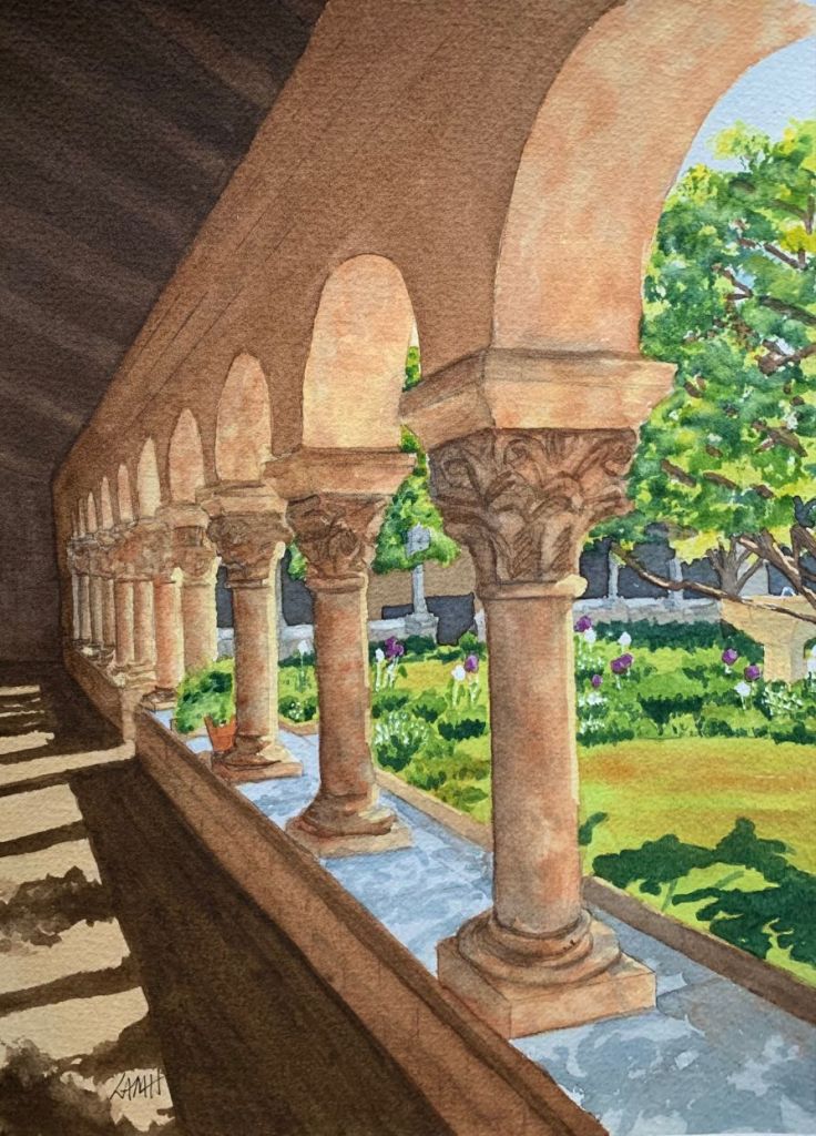
“The Cloisters” Watercolor Painting – Big shapes.
THEN THOUGHT TURNS TO ACTION.
To this point, everything has been happening inside your head. Now you can take physical action.
Once you have thought about what to use as your big shapes, roughly sketch them (onto a page in your sketch book or on scrap paper). Analyze and adjust the shapes to follow the recommendations for creating a ‘good shape.’ Remember to incorporate any unique features of the subject (sky holes or uneven heights in a bank of trees; tires and reflective windows on a car; masts on a sailboat). Make sure the shapes have an interesting relationship to the other shapes in the painting. Always work from the largest shapes to the smallest shapes, and leave out all consideration of the details until all of the shapes are well established on the page. Try to have all of the major shapes be a different size, with exterior angles not the same.
Assign each shape a value, and try to keep your lightest value shapes close to your darkest value shapes, thus creating the strongest focus and contrast. You could put your center of interest where the strongest value change, and largest shape, are located. Once you have the design finished, sketch it on the watercolor paper.
TIME TO PAINT.
First layer: Paint the light values, laying in the main colors.
Work from light to dark. Begin with light colors that have been thinned with water. Colors should flow easily. Use a creamy mix of paint that looks light, though not washed out, so that it will be colorful enough not to require too many layers. Don’t worry about shadows or details in this first layer. Leave white highlights unpainted. This first layer often covers a whole object (except highlights) or even the whole paper, depending on your design.
Let this layer dry before adding a second layer, unless you intend some wet-on-wet work.
Second layer: Paint the mid-tones, starting to build contrast.
When the surface is dry, you can “glaze,” using a mixture which is slightly stronger (with more pigment) than the previous color. Paint only the shapes that have a visible increase in value, leaving lighter areas untouched and still visible in this layer. Your paint mixes will be thicker and darker. You can start to build up shadows and stronger colors.
Third layer: Paint details and dark shadows, working on specific areas.
Leave the previous layer to dry completely; then make a stronger, darker mixture of paint. With the underlying light and middle values painted, proceed to the darker values. This final layer, like the second layer, doesn’t cover the whole of the surface but leaves parts of the previous washes exposed.
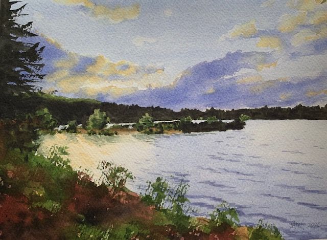
“Wachusett Reservoir Sunset” Watercolor Painting – Lights, darks, mid-tones.
Move from the LIGHTEST colors toward the DARKER ones. Also, work from LARGER shapes to SMALLER, and from the general ideas to the more specific. Details come last.
FINAL REMINDERS:
Identify the big shapes of light, medium, and dark values, and plan the painting in terms of light and dark-valued shapes, perhaps rearranging or grouping shapes to touch or overlap other shapes in order to improve the picture. It’s important to limit the number of dominant shapes, for example, to three, seven, or twelve to simplify and add power to your composition.
While painting, keep in mind your chosen values. Put some change of color or texture into each shape, and ensure that the edges have variety.
Make sure as well that each shape has a consistent VALUE. There can be COLOR and EDGE variations, and slight changes in value are okay, but drastic changes in value will break down and alter the integrity of the shape, destroying its continuity.
Keep the painting simple for impact. Once the light and dark pattern is in place, the values are grouped, and mid-tones are established, you can add some detail, but not too much.
Join me and get painting tips, inspiration, recent art news, or information about new art or products for sale, sent to you by email. Subscribe here. I’ll give you a free copy of my Color Blending Tips pdf. that you can download and print.

I learn so much by reading your blogs and then I read then a second time. I haven’t painted landscapes but the steps here make it easier for me to pick out something and take that plunge. Thanks for all your blogs. They are so helpful.
LikeLike
I’m thrilled that the blogs are helpful for you and you are learning from them! You’re very welcome.
While what I love most to paint are landscapes, most of my writing would apply to painting other subjects as well. Taking the same steps you mention would also help you analyze whatever you’d like to paint in watercolor. Yes, take the plunge and give it a try. The more you do that, the easier it gets. And the better you get.
Thank you for reaching out to comment. I appreciate your thoughts.
LikeLike
I appreciate what you are doing in your blogs — it is making me think a great deal more about my efforts, rather than to just plow ahead to try to get something on the paper that might turn out well.
LikeLike
Good work, Ron! By thinking about where you want to go and the route to take, you’ll be much more likely
to arrive at your desired destination (in painting AND in life). Keep it up!
Thank you for your input.
LikeLike